Imagine going to a store looking for a shirt. But there is a slight difference from other regular stores – there are no signs. No visible aisle markers, no department labels, and no clear product category indicators. In other words, there’s no way to know where to begin and where to go. Just a lot of customers wandering around, feeling as lost as you are.
Well, this is what we would have to deal with if they landed on a platform with poor navigation. Just like a map, a navigational tool includes links to our website’s most important categories and subcategories (if necessary) of our website. It tells our users where they are, where else they can go, and what they can do there, providing a clear direction for our website.
Types of Navigation Tools
When thinking about navigational tools in UI design, we’re talking about Sidebars, Drawers, and Tab Bars. So what is the difference between them, and which one is a better fit for your design? Read on to find out what sidebars are, what drawers are, and what tab bars are while also understanding the difference between them and when to use each of them.
What are Tab Bars?
Tab bars are UI elements commonly used in mobile applications to provide a set of navigation options or actions. They typically appear as a horizontal bar at the bottom or top of the screen and contain multiple tabs, each representing a different section or feature of the app.
When our users tap on a tab, it switches the content displayed on the main screen to the corresponding section. This way, it allows for easy navigation and access to various functionalities within the app. Tab bars are an intuitive way to organize and present information in mobile interfaces, making it convenient for users to switch between different app sections with a single tap.
40% OFF
Only this February
Upgrade to UI PRO version of Uinkits Systems to unlock 23.000 UI components.
Use the code "FEB40"
What are Sidebars?
Sidebars are user interface elements commonly found in digital platforms, websites, and applications. They are vertical columns placed on either side of the main content area, usually to the left or right of the screen. In design, sidebars serve as a navigation aid and provide easy access to various sections, features, or platform options.
In the context of web design, sidebars often contain links to different pages, categories, or areas of the website. They can display menus, search bars, social media links, advertisements, and other additional content. On the other hand, in applications, sidebars help users navigate between different views or functionalities. They can host icons, buttons, or text links representing specific actions, settings, or categories relevant to the app.
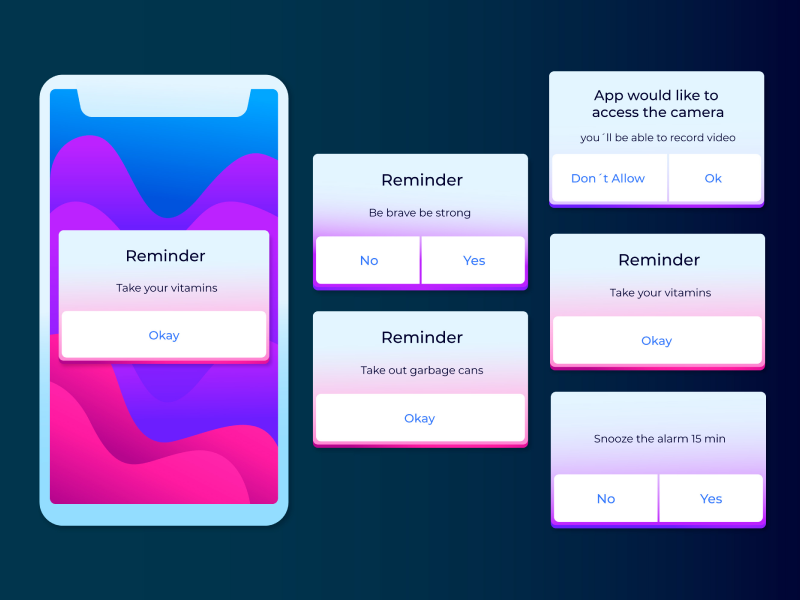
What are Drawers?
Drawers are interactive UI elements that slide in and out from the edges of the screen, typically from the left or right side. Drawers are used to display additional content, options, or settings without taking up much space on the main screen. Users can trigger the drawer to appear by tapping or swiping on a button or icon when they need to access specific features or information. When activated, the drawer slides into view, displaying its content, and can be closed by sliding it back off the screen or using a close button.
In design, drawers are commonly used in mobile applications and responsive web design to provide a clean and uncluttered user interface. They are especially useful when there is limited screen space, as they allow developers and designers to hide secondary or less frequently used content until it's needed. They are also used in settings or preferences screens to provide a clean and organized way to present configuration options to our users.
Tab Bars vs. Sidebars vs. Drawers
We know. Choosing a good navigational tool for your UI UX design can be confusing. Especially when you have so many options. Should I choose a tab bar? But what if a sidebar is better? But wait, a drawer is much trendier.
As UI UX designers, we’ve all been there, and we know your struggle. So, we’ve broken down the difference between tab bars and sidebars, the difference between sidebars and drawers, and an overview of how these navigational tools are distinct.
Tab Bars vs. Sidebars
Indeed, both sidebars and tab bars achieve the same goal: to help our users access the relevant content much easier. However, they are fundamentally different because of their positioning. Even their names suggest this. While sidebars are vertical columns placed on either side of a platform, tab bars are horizontal bars positioned at the top or bottom of the screen.
This key difference between sidebars vs tab bars brings to life even more distinctions. Sidebars are usually used when creating the interface of a website or application specifically for a desktop screen. On the other hand, tab bars are more commonly seen on mobile devices. This choice is deliberate, as sidebars would take up just too much valuable space on smaller screens. Because of the limited space available, tab bars are mainly used for applications to allow our users to switch between different sections.
Sidebars vs. Drawers
The difference between sidebars vs tab bars is visible – there’s no denying that! Even the user can consciously make this distinction. However, when it comes to the difference between sidebars and drawers, the distinctions might not be as apparent at first glance.
But in order to understand how they differ from each other, think of drawers as sidebars that can open and close, unlike sidebars which remain fixed and always visible on the screen. Drawers are hidden navigation elements that slide in from the side or bottom of the screen when activated – whether by click or hover. Yes, they are the slide-out menus or hamburger menus.
While both sidebars and drawers serve the same purpose of providing navigation options, drawers offer a more compact and space-saving solution. They are commonly used in mobile interfaces to conserve screen real estate and reduce clutter. Sidebars, on the other hand, are more common in desktop applications and websites, where space is less restricted. Even more so, in most cases, when a platform has a sidebar on a desktop screen, it’s highly likely that it will transform a drawer on a mobile screen.
Key Differences Between Tab Bars & Sidebars & Drawers
Position
Tab Bars: Horizontally at the top/bottom
Sidebars: Vertically on the side
Drawers: Hidden off-screen – can be revealed from anywhere
Common Use Cases
Tab Bars: Navigation in mobile apps
Sidebars: Navigation in websites
Drawers: Navigation, menus, filters – on apps and websites
Visibility
Tab Bars: Fixed or hidden when scrolling
Sidebars: Always visible
Drawers: Hidden until activated
Content-Type
Tab Bars: Navigation and quick access to main sections
Sidebars: Navigation, grouping options, additional content
Drawers: Navigation, actions, additional content
Common Platforms
Tab Bars: Mobile apps
Sidebars: Web applications and desktop software
Drawers: Mobile apps and responsive web design
Uinkits – Our Figma Design System and UI Kits
We at uinkits understand the importance of great user experiences and creating amazing UI designs. That’s why we’ve developed a Figma UI Kit with design components that include these essential UI elements that enable you to design intuitive and user-friendly interfaces effortlessly.
“You press the button, we do the rest,” – Kodak.
Inspired by this iconic tagline from Kodak, we believe in simplifying the design process for you. Our Figma UI Kit, uinkits, is a complete design system with UI components that allows you, as a UI UX designer, to create your products as quickly as pressing a button.
Our design system includes components, icons, variables, cards, buttons, and everything you need for your design process. All you have to do is take your UI design component needed, and you’re ready to use it in your designs!
By
Cristi Fonea
•
July 23, 2024


