One of the biggest tech trends in the last decades circles around screens getting bigger and wider. Although it may seem that since the rise of personal computers in the 80s, devices have become more compact and small to support usability and usage outside of our homes, we can take a look at the evolution of mobiles and notice how their screens have taken up more and more space of the overall surface of them.
A great step in this direction was symbolized by Apple’s 2016 launch of the iPhone 7, for which they were leaving the home button behind to make room for more space for the screen. This not only revolutionized the quality of the graphics, but it also significantly increased the user experience by getting rid of the troublesome button. With devices transcending more and more toward a big-screen approach, UI UX designers had to come up with inventive and practical ways to arrange user interfaces. One of the solutions we are still implementing is navigation rails.
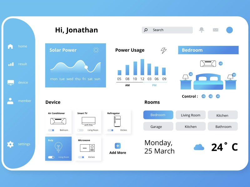
Navigation Rails are UI design elements found in medium or large layouts – both websites and applications. They are vertical columns placed on either side of the main content area, usually to the left or right of the screen.
Navigation Rails serve as a navigation aid and provide easy access to various sections, features, or platform options. They support up to 7 navigation items and are always in the exact location – even when going from different screens within an app. In web design, sidebar navigation contains links to different pages, categories, or areas of the website.
As UI UX designers, it is important to be familiar with the components that make up a navigation rail, so that we know how to integrate them into our web designs.
Anatomy of Navigation Rails
- Navigation Container
- Menu/Index – this component is optional
- Action Button – this component is optional
- Active Indicator
- Active Icon
- Active Label – this component is optional
- Inactive Icon
- Badge (large)
- Badge label (large) – this component is optional
- Badge (small)
- Inactive Label Text – this component is optional
Menu
- Navigation Items – The primary purpose of a navigation rail is to provide easy access to different sections or pages of the website or application. Do not forget about the navigation links.
- Icons or Symbols – They are visual cues that help users recognize the purpose of each link without relying on textual descriptions (labels).
- Call-To-Action Buttons – Navigation rails often feature essential CTAs that prompt users to take specific actions – for example, signing up for newsletters, subscribing to services, or initiating contact.
- Social Media Links – These can help promote your social media presence and expand your brand’s online presence.
- User Profile – Include account settings, preferences, and personalized content.
Behavior
When a user interface scrolls horizontally, the navigation rail can either scroll off-screen or stay in a fixed position. Add a divider to indicate that the content is scrolling underneath the navigation rail.
Selection
When a user selects another navigation item (different from the initial item), the platform should immediately navigate to the destination page that the new item triggered. This is done through a transition pattern and leaves the other pages inactive.
If the user selects the same navigation item that it is currently on, the app might reset to the initial place of the screen (usually the top). But it could also leave the item fully inactive, and the action does not trigger anything on the page, leaving the screen as it is.
Size
During the design process, we need to pay attention to a few aspects of the size of the navigation rail. Pixel density dictates whether or not we should integrate a navigation rail into our UI UX design. Generally, if our digital product is used in a compact window under 600dp, we should switch to a navigation bar instead. On the other hand, if our product is used for a desktop screen of over 1240 dp, the better alternative would be to design a navigation drawer.
Navigation Rails can be used for any web design, depending on the UI UX designer’s goals. But they are especially important in these cases:
Content-heavy platforms represent news websites, blogs, or social media platforms. These platforms need navigation rails because they have a lot of information and various sections to navigate through. If we choose to insert a navigation rail into our UI UX design, we can enhance the user experience by offering an intuitive and accessible navigation alternative.
- SaaS Platforms and Desktop Applications
Navigation rails are becoming more and more popular on SaaS platforms and desktop applications. They act as the central hub of these platforms because users need to switch between different sections or features. Here, sidebars are not only used for navigational purposes. They can also show users the next steps they must follow and their progress.
The more products or services the online store offers, the more links will be needed. Navigation rails are needed to group categories and filter the products. This way, they offer users an efficient and organized structure.
We at uinkits understand the importance of great user experiences and creating amazing UI designs. That’s why we’ve developed a Figma UI Kit with design components that include these essential UI elements that enable you to design intuitive and user-friendly interfaces effortlessly.
“You press the button, we do the rest.” – Kodak.
Inspired by this iconic tagline from Kodak, we believe in simplifying the design process for you. Our Figma UI Kit, uinkits, is a complete design system with UI components that allows you, as a UI UX designer, to create your products as quickly as pressing a button.
Our design system includes UI components, icons, variables, cards, buttons and everything you need for your design process. All you have to do is take your UI design component needed, and you’re ready to use it in your designs!


