A good UI UX design should be eye-catching, and intriguing, but also easy to navigate – we all know that!
And in the design process, drawers do just that. In fact, drawers are exactly the UI elements that help us create an immersive experience for our users.
Do you remember those childhood interactive books that had different integrated items and secret passageways that you could access by pulling, opening, or sliding over certain portions? Drawers act similarly. They contain various details that are not displayed on the main page.
What are UI UX Design Drawers?
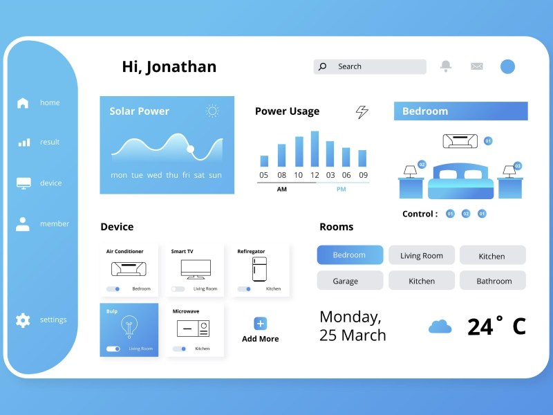
In UI design, drawers are a type of navigational element that slides out from the edge of the screen. The name of this component is very intuitive because it follows the same principle a real-life drawer would, mimicking the gliding motion. This occurs when a user needs to access a piece of information without leaving a page. This element can appear from any part of the screen, whether it comes from the top, bottom, left, or right, and should be adjusted depending on the layout and context.
The size is also an adjustable characteristic of this component, which can range from smaller to having the drawer displayed in full-screen mode. The values that they can take are the following: xs, sm, md, lg, xl, and full.
If we want to understand exactly what a graphic design drawer is and how it acts, we have to look no further than at the official Forbes website. At the top left corner of the main page, we can notice three horizontal white lines. After clicking them, a drawer in the form of a hamburger list will display over ten different menu entries from which we can land on various sections of the app or web design. This particular UI drawer will remain open on the page until we press the X button that has replaced the initial three lines since we clicked them.
How To Use UI UX Design Drawers
1. Contextual Information
The first purpose of a UI design drawer is to integrate additional information that did not already exist on the main page. This mainly happens due to a lack of space. We want to avoid overcrowding a page that could confuse our users while also giving them the option to multitask. For example, a UI-designed drawer could contain information on shopping carts, and users would still be able to navigate the main page while checking the side drawer.
Multitasking saves time!In UI UX design, drawers can also display text-only information such as dictionary entries or reference links. This saves users the task of scrolling down to the bottom of the page for this data or opening a different tab.
2. Simple Forms
UI UX design drawers can often include simple and optional forms. Besides this, configuration options are sometimes included inside drawers to simplify and improve the user experience. This automatically will increase the success rate of our design.
3. Navigation Drawers
UI drawers can also contain extensive lists with entries such as menus. These are called navigation drawers and they usually consist of many headings that lead to different parts and articles of a website. These are the most common types of drawers used in the design process and can be viewed on a wide number of websites and apps.
40% OFF
Only this December
Upgrade to UI PRO version of Uinkits Systems to unlock 23.000 UI components.
Use the code "DEC40"
What Are the Elements of A Drawer?
Main Elements
The core form a drawer takes is pretty simple. It consists of three main sections, which are: header, body, and footer.
- Links
Rather than referring to cities and streets, when it comes to navigation drawers, destinations are actionable list items. They can either be represented through text or, in some cases, come alongside a form of imagery.
One of the most important things to keep in mind when it comes to destinations is that they must be short. In the UI UX design world, drawers offer a limited amount of space. We cannot have our entries in a navigation menu exceed the space limit and risk overlapping with other text or ending abruptly.
In cases in which the text of a destination is too long, we should avoid turning a one-line entry into a multiple-line entry. Shrinking the size of the text to make it fit into one line is also a no-go. As an alternative, you should find a way to express the destination in fewer words or come up with shorter synonyms.
Punctuations such as commas, periods, and semicolons are not recommended. While we’re at this topic, we should only place full stops when we are dealing with a full sentence, but avoid it otherwise.
- Icons
Icons can sometimes help with a more robust and easily recognizable design. If we want to link an icon to a destination, it should always be placed before the text. The design of the icon should be as minimalistic as possible, as we do not want to overcrowd our drawers. A common example of an icon that is attached to a destination is the Favourites menu entry which has a heart-shaped symbol next to it. A poor choice would be an overly complicated and obscure icon or one that does not necessarily match the text it is linked to.
- Dividers
Dividers are thin lines that can be displayed horizontally or vertically to establish a visual hierarchy. They are often added to drawers to efficiently group and order information into different categories.
If you were to take a look at one of your wardrobes, items of clothing such as lingerie are probably separated from shoes and coats through a small piece of wood. That small element of furniture is a divider in UI.
- Full-bleed dividers are useful when we need to separate content sections that are distinct from one another. We will implement these dividers where a clear distinction between content areas is needed. For example, if we enter the official Vogue website, we can notice how the menu entries that link to articles in the magazine are separated from the sign-in section through a full-bleed divider.
- Inset dividers are suitable for separating related content. These dividers are mostly implemented due to aesthetic reasons, but they also aid visual scanning of the page. A good example of this is the L’oreal website. They use inset dividers in the case of the brands they own, which works because they are related to the same topic. Another advantage of using this divider is that it can offer space for flags and status icons to appear.
Features of UI UX Design Drawers
These UI UX design elements have distinctive features: type, closing method, and interaction.
- Type. A drawer can slide over the content of the page, which makes it an overlay drawer. We can easily single out an overlay drawer when the content becomes partly overshadowed. The text on the parent page can also be pushed by a drawer, making it an inline drawer.
- Closing method. There are different ways in which we can close drawers. One option would be through explicit control. In this case, users have to click on a button, icon, or tab to close the drawer. Implicit actions may also be taken as closing methods. If we opt for this, we have to click to touch a navigation control within the drawer, or we can also touch anywhere outside of it.
- Interaction. We can offer users the option to perform actions outside of the drawer while it is open. In these cases, the interaction becomes modeless. This is commonly used for websites where the properties of a product are displayed. For example, let’s say that you were to navigate an app where you can customize laptops. While you are clicking on the options in the drawer (such as the resolution, color, and storage), the price on the main page for the laptop will update. You would also be able to manipulate the laptop while the drawer containing the options remains open.
Drawer vs. Dialog
These two UI elements are often compared, as they share many common traits. However, we must opt for the most suitable one when we are planning out the design of a web page or mobile app. Dialogs are modal windows that appear in front of app content to provide urgent information and signal to the user that they must perform a critical action.
Think about these two components as transient tabs that will be closed once the visitor has completed a specific operation. The main difference arises in the message. Drawers help us gather more information about certain related topics, while dialogs expect an immediate reaction from us.
Due to their disruptive nature, we should avoid overusing dialogs as they can decrease the overall usability of our website. A more convenient alternative would be choosing a drawer, as it does not require users to make any adjustments to its size or position to visualize it. Another benefit of using drawers is that they can share a common scrollbar with the main page. This makes drawers mobile-friendly.
One disadvantage of drawers is that they can only emerge from the margin of the page, as opposed to dialogs that may be suitable for shorter messages. For example, we would not choose a drawer for an error message, because we want it to alarm the user and appear on a central point of their screen. Instead, we should choose a dialog.
Drawer vs. Sidebar
A drawer can be opened and closed. A sidebar is there to stay! The most evident difference between these two UI elements is that the sidebar is always displayed while navigating a website. Drawers require us to open them manually to interact with their content.
We can look at drawers as a space-conscious choice of providing navigation options. Their mechanism makes them fairly suitable for mobile app usage. In the case of sidebars, they can be convenient for information that is more vital and sought after by users. Sidebars work well on desktops and websites that do not lack space and feel cluttered.
uinkits – Our Figma Design System and UI Kits
We at uinkits understand the importance of inputs in great user experiences and creating amazing UI designs. That’s why we’ve developed a Figma UI Kit with design components that include these essential UI elements that enable you to design intuitive and user-friendly interfaces effortlessly.
“You press the button, we do the rest,” – Kodak.
Inspired by this iconic tagline from Kodak, we believe in simplifying the design process for you. Our Figma UI Kit, uinkits, is a complete design system with UI components that allows you, as a UI UX designer, to create your products as quickly as pressing a button.
Our design system includes components, icons, variables, cards, buttons, and everything you need for your design process. All you have to do is take your UI design component needed, and you’re ready to use it in your designs!
By
Cristi Fonea
•
September 5, 2024


