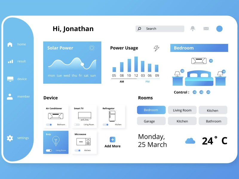
UI UX design has come a long way in the past decades. With more and more technological advances, the user interface has become more accessible, intuitive, and efficient. There are many strategies that can be applied to websites and apps in order to make them more compatible with multiple categories of users. One of the means that are implemented to guide users toward easier navigation is to provide them with feedback.
And feedback does not necessarily need to come in the simple form of adding a new paragraph to the text on the website. There are more creative and space-conserving ways to achieve this. For example, inserting toasts into the user interface. And no, we are not talking about the device that makes delicious, warm bread (even though, just like toast bread, our toast component can also be customizable). So, let’s dive into the nitty-gritty of this helpful UI element and see how UI UX designers implement them.
The toast is a UI design element that acts as an easily customizable feedback message that appears on the users’ screen to provide them with some type of feedback. They are often displayed in the corner of an app or website’s user interface.
To understand the importance of toasts, let’s imagine that we were carefully crafting a post for our business Facebook page, announcing something important about our company. We have been searching for the right words for the past 10 minutes when we decide to finally hit the share button. However, the page is taking some time to load and we are now growing impatient because we are starting to worry that our post did not get uploaded and it was lost.
However, when a toast pops up on the screen, with the purpose of informing us that we have successfully uploaded the content to the platform, we are no longer in a stressful and inconvenient situation.
As UI UX designers, it is important that we are familiar with the various types of toast that we could use to integrate into our web designs.
The default or the basic toast allows users to act on the message it is sending to them. One example in which this can be implemented is for undoing a certain action.
Another option for using toast is to implement multiple ones - more than one toast can be displayed at once, depending on the case.
This type of toast allows for customization in the case of how long it is displayed on the screen. The default duration of a toast is 5000 milliseconds.
This type specifically refers to cases in which users can act upon a certain task.
These toasts have the role of signaling to users that an error has occurred and that they will need to act upon it.
Another type of toaster is the one that communicates to users that an action has been successful.
There are a few design principles and aspects that we should take into consideration during the design process.
- Text. The text that is included in a toaster should be straightforward and easily accessible to all users. We should avoid adding large bodies of text, and instead stick to simple and intuitive wording.
- Size. Because the toast is a UI element, it needs to support visual balance in relation to the rest of the design. The sizes a toast can take are large, medium, and small, and they will take a certain size depending on the context in which they appear.
- Color. Because toasters are UI design elements, the colors that are applied to them are essential for a good user experience. There are two main aspects regarding the color of the toaster. The first one is that it needs to match its purpose. For example, a toast that is meant to communicate to users that an action was successful should be a shade of green. The second aspect that requires attention is that the color of this UI element needs to match the overall aesthetic of the website or page.
- Position. During the design process, the positioning of toasts on a website or app also needs to be carefully calculated. For a user interface to maintain harmony, the toast should pop up near the element or action it is related to.
We at uinkits understand the importance of toasts in great user experiences and creating amazing UI designs. That’s why we’ve developed a Figma UI Kit with design components that include these essential UI elements that enable you to design intuitive and user-friendly interfaces effortlessly.
“You press the button, we do the rest,” – Kodak.
Inspired by this iconic tagline from Kodak, we believe in simplifying the design process for you. Our Figma UI Kit, uinkits, is a complete design system with UI components that allows you, as a UI UX designer, to create your products as quickly as pressing a button.
Our design system includes components, icons, variables, cards, buttons, and everything you need for your design process. All you have to do is take your UI design component needed, and you’re ready to use it in your designs!


