Communication is key when it comes to any domain. We, as humans, learn how to communicate from a young age and are able to deliver emotions and feelings through messages, speaking, and even with our body language. When designing a platform, we look for a purpose or a goal that will be the main focus of our design. Whether we are selling a product, building a blog, or creating a social media platform, we need means of communication and this is where inputs can come and help us.
Inputs can help us obtain the information needed if we are designing a platform that will require address, phone number, credit card details, passwords, text, email, and any type of information indeed from the user.
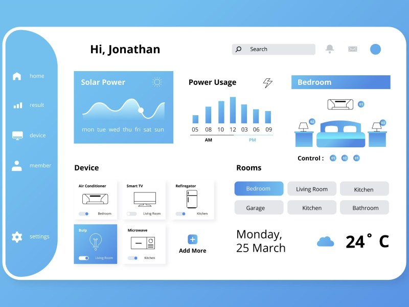
An input text is a general term used in UI UX design that represents any user interface component that gives the user permission to enter or input a text. Input fields are an important element of the UI/UX design, being used in different situations with the main goal of obtaining information or data from the user.
A few examples would be text, passwords, email, URL, phone number, date, birthday, card details, and not only. But, in order to complete its purpose, this component needs to be efficient and offer the user a friendly and deductible interface that is typically encountered in dialogs or forms.
When designing an input, you need to make sure that the UI text field is as noticeable as possible. And also, be sure that the user will understand the message by using a clear input description in order to generate a good user experience.
Colors
So, to get more in-depth on this matter, we need to pay attention to color contrast and how it can elevate or even downgrade our input fields. When it comes to creating an aesthetically pleasing UI/UX design, we need to pay attention to the color ratio, and it can impact our user accessibility. After all, the purpose of an input field is to collect data, so we need to make sure that every user can identify and spot our input text as quickly as possible. So, the contrast between our input design and the background should create optimal usability.
Even more so, the input text should give the impression that it is interactive even from the start as an input field should be deductible. And, to do so, you can use calls to action, like “write…”, “type in…”, “choose…” that will encourage the user to complete the input field.
Input Types
- Single-line UI text field. As the name implies, single-line UI text fields use only one line of UI text, and as the cursor reaches the right edge of the field, the input line will automatically scroll in order for you to see what you are typing. However, if you are looking for longer answers or to collect longer data, you might need to opt for a multi-line input field.
- Multi-line UI text field. With this type of input, you have the ability to see all the input at once, as the field will expand depending on your needs. At first look, a multi-line UI text field will look similar to a single-line UI text field, so your design will keep its aesthetically pleasing appearance and, at the same time, will have the capacity to take in a larger UI text.
- UI text areas. For this type of input, the UI text field is taller. The UI text overflows into a new line. When using the UI text area you expect larger responses and also encourage users to fill in larger responses than the ones expected when you use one-line inputs.
Behavior
When it comes to the way the input field interacts, it is worth mentioning that scaling and adaptation are two of the most reliable tools for a UI text field that can expand and take up the space available for your design. So, it is important to create adaptable text inputs to avoid the situation where long and not aesthetical UI text fields will exist.
Create A Better User Experience
Creating meaningful and fitting user experiences for your users is one of the essential tasks when it comes to UI UX designing. So, finding the suitable usability and efficiency needs to be at the forefront of our minds when creating a new product. However, we can all agree on the fact that doing less is more when it comes to filing forms, writing down information, and completing different dialogs. So, auto-complete just seems to be the right choice.
The auto-complete process happens inside the UI text field, as the software predicts your available options by using its internal dictionary. It analyses what you intend to type depending on the first letters and the suitable options, filling in the most fitting variant available from the dropdown. So, with autocomplete, your user can focus more easily.
Another viable option is using auto-suggest. They are usually encountered in your search bar and can save you a lot of time. Autosuggest appears in the form of a dropdown, and its purpose is to offer you more variants It can prove to be very helpful when the users already know what they want to fill in. Autosuggest offers variants for your input field based on the letters or terms you have typed. To get a better understanding, think about when you are completing a survey, and you need to fill up the country that you are from. When you type the first letters, that autosuggest can really come in handy.
Another important practice you can follow for a better user experience regarding inputs is to use pre-filled and smart defaults. These features are often dictated by the IP address and can recommend what you might want to fill in. A good example is when filling in the region you are from or the postcode number.
And don’t forget any information that you might believe would help the user. If you consider that your users will need some extra insights when completing an input, don’t hesitate to add whatever is necessary to create the best user experience - this is the foundation of a good web and mobile design practice.
Every design element has different states that can be or not be noticeable to the user. However, when it comes to input fields, they need to be noticeable in order to generate a better user experience.
- Activated. This state can only happen when a user interacts with the input. Usually, the user can observe when an input is activated as it changes its appearance, being highlighted or having the borders highlighted.
- Inactivated. This state can be seen at first sight, also known as the initial state of the input.
- Default/ Disabled. This state indicates that the input field can interact, but it is enabled by the system.
- Hover. The state in which the user has the cursor over the input field.
- Focus. This states that the input is ready to interact. Usually, in this state, the outside of the element is given an outline.
- Error. You can only see this input state only when filling in a typo or wrong information.
We at uinkits understand the importance of great user experiences and creating amazing UI designs. That’s why we’ve developed a Figma UI Kit with design components that include these essential UI elements that enable you to design intuitive and user-friendly interfaces effortlessly.
“You press the button, we do the rest.” – Kodak.
Inspired by this iconic tagline from Kodak, we believe in simplifying the design process for you. Our Figma UI Kit, uinkits, is a complete design system with UI components that allows you, as a UI UX designer, to create your products as quickly as pressing a button.
Our design system includes UI components, icons, variables, cards, buttons and everything you need for your design process. All you have to do is take your UI design component needed, and you’re ready to use it in your designs!