Websites and apps have been experiencing a rapid evolution toward more and more user-generated content. If, in the early days of the internet, it was not as common to go on the world wide web to share your own content, and it was more likely that users were just browsing already-made content, today’s day and age presents a far different scenario.
While it is a pretty difficult task to trace back to when the user-generated content era came into full force, social media was a strong contributor to this phenomenon. This is mainly because it has never been so easy to create and share content, whether it is text, videos, images, or other types. One of the quickest and most straightforward methods for users to transfer data onto a website or an app is through the file upload UI design element.
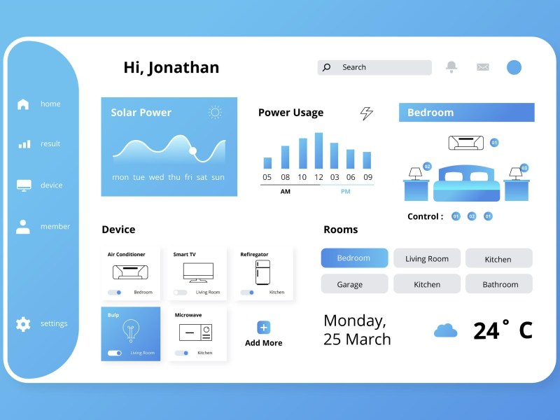
File upload components are UI design elements that allow users to upload content from their devices.
In UI UX design, file uploads are usually found in forms, but they also appear in chats, dialogs, modals, and other sections where users are required to upload files or attachments. They can also be standalone elements that work individually on a user interface. File upload components are triggered by clicking on it to upload. But for a better user experience, they should also be drag-and-drop.
Types of File Upload
As UI UX designers, it is important to be familiar with the forms file uploads can take. File upload components can be presented in three ways, depending on the available space and the design goals of the user interface.
- Input Only
When there is limited space – especially on mobile screens – a simple file input field can be used. This type of file upload component is represented by a text input box and a “Browse Files” or “Choose File” button.
- Drag And Drop Add-On
With drag-and-drop add-on file upload, users can drag files from their device and drop them into the designated area within the interface. This has the same format as the “Input Only” type but with the addition of the possibility of a drag-and-drop feature. This is more suitable for larger screens – such as laptop or desktop screens.
- Drag and Drop Area Only
This can be used when the main focus is on uploading files. This file upload type can be used without an input field. Make sure the elements within the file upload are intuitive so that the user knows what to do.
As UI UX designers, it is important to be familiar with the components that make up file uploads so that we know how to integrate them into our web designs.
1. Anatomy
- Input field. The input field is the designated space for the file name, as it allows users to see the name ascribed to a file. In this way, it is easier for users to be reassured that they are uploading the right information to the web page.
- Button. It is essential to pay attention to this file upload component during the design process because it will directly impact the user experience. The button needs to be visually distinguishable, so it should have a defining trait.
- Drag and Drop. The drag-and-drop section of a file upload is clearly delimitated from the rest so that users know where they can add the files. They usually have a different color than the background, to keep a visual balance in the user interface.
2. Size and Styling
Use icons relevant to the files expected from the users. The icon and text weight should be similar – don’t use a bold icon next to a light text label. Make sure to maintain consistent spacing on all sides – the line height of a typeface should not exceed the height of the actual characters.
3. Status
The input field of the file upload component has five status properties: none, done, warning, error, and loading. Statuses are useful tools in the design of user interfaces because they provide users with clear visual cues about a process they are performing.
4. Size
Size is another trait that we need to take into consideration during the design process of file uploads. Generally speaking, there are three sizes that file uploads can take: small, medium, and big. The size we pick for our UI UX designs depends on the importance they serve in a specific context.
5. Speed
The upload speed is another essential factor we need to consider during the design process. In this day and age, users expect files to be uploaded quickly. This means that if our website or app will have a slow upload speed, users might stray away from using it because it ruins the experience for them.
6. Security
When users upload files onto a website or an app, they want to be sure that their data is protected and safe. Fortunately, there are plenty of means through which we can ensure our users that their data is being protected, such as requesting authentication methods, limiting file upload numbers, and implementing various security policies.
We at uinkits understand the importance of great user experiences and creating amazing UI designs. That’s why we’ve developed a Figma UI Kit with design components that include these essential UI elements that enable you to design intuitive and user-friendly interfaces effortlessly.
“You press the button, we do the rest.” – Kodak.
Inspired by this iconic tagline from Kodak, we believe in simplifying the design process for you. Our Figma UI Kit, uinkits, is a complete design system with UI components that allows you, as a UI UX designer, to create your products as quickly as pressing a button.
Our design system includes UI components, icons, variables, cards, buttons and everything you need for your design process. All you have to do is take your UI design component needed, and you’re ready to use it in your designs!


