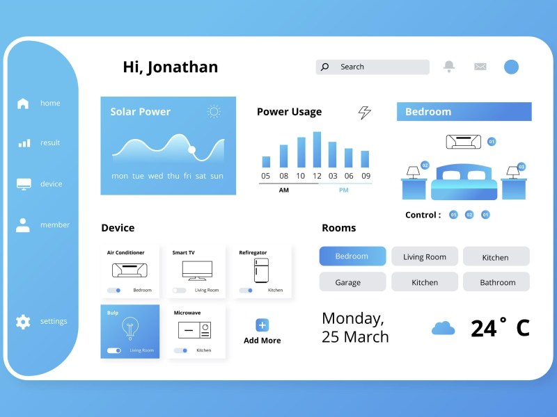
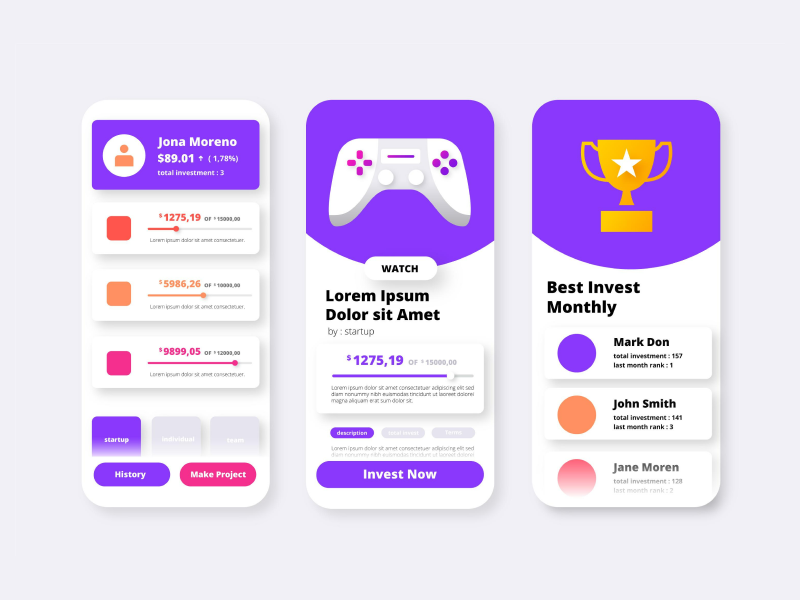
With software apps and dashboard management platforms becoming more and more popular, charts have also started becoming fundamental in the UI UX design process.
Although to the human eye, the website or app design looks like it was effortlessly done, the reality is that it takes a lot of time (and effort). And, usually, we don’t have enough of it to spare.
However, to measure progress or observe changes, we need charts and graphs. So, to help you stay productive, I will give you a more in-depth overview of this design system element.
A chart is a UI design element that aims to organize data. At the same time, it helps the user see and analyze the information received, making it easier to comprehend. Charts need to be easy to read, and depending on your targeted audience, you need to make sure you use the right chart type in order for everybody to understand the information presented. Sometimes, it can be hard to get to the bottom of a chart, so ensure you deliver a good user experience by choosing the right chart to represent the message.
As with every UI UX design element, charts come in different shapes, forms, and colors and can set the whole atmosphere in your design. They can catch the eye of the user and be the element that distinguishes your creation between a good and a bad UI UX design.
Selecting the appropriate chart representing the data you are working with is an important part of the process. It might be fairly helpful to follow a step-by-step guide on how to organize this task.
- First, you must have a clear vision of the data you need to showcase. So, take your time and review the data you must display. See if it will require numbers or if it will be a categorical graph. Understand the message and think about what you will convey.
- Learn the differences charts can make with your message. Like anything in life, a small detail can make a difference. Some charts are more suitable to expose the differences between given categories, some can express better changes over periods of time. To understand their qualities and use them to your advantage.
- Don't overdo it. You don’t need to prove anything when it comes to choosing the chart. Don’t go for one that is not suitable for your information just because it looks like it came from the future. Your goal is to make sure the user understands what you are presenting, so stick to something more deductible for the type of information you are sharing.
- Ensure that the axis used to create the charts is placed correctly and labeled appropriately and accordingly with the information.
- Go for something that is aesthetically pleasing and yet easy to read.
In any design process, charts can be of many types and help you deliver a specific message. When you are talking about a more complex matter, you can’t use pie charts. When we want to create a chart that follows the journey or the transformation during a specific time frame, it is recommended to use line charts, as they will better capture the evolution.
So, let’s take a better look at the types of charts. The main types of charts are pie charts, donut charts, line charts, bar charts, radial charts, composed charts, and scatter charts.
- Pie charts – It’s safe to say everybody knows these charts. They are designed using a round shape, and each slice represents a different category illustrated. They are easy to understand, as the size of the slices is proportional to the category or value that they represent. Charts can be used when the data provided is not divided into too many categories. So, you can see these charts when dividing the toys from a box by color or when separating the vegetables from your garden.
- Bar chart – As the name suggests, bar charts can be horizontal or vertical. They are designed using rectangular bars of different sizes to illustrate the differences between the categories displayed. So, the values are represented by the length or height of the rectangular lines. This type of chart is usually used in business or financial areas to showcase different points in time. One axis represents the time spent and one the changes that have occurred over a budget.
- Line and wave charts – Those charts can represent values about the provided data. We can express comparisons, bureaucracy, or even highlights, trends, and patterns over a period of time. The chart is usually divided into two axes, X and Y, and a line representing the activity of the specific values depicted in the analysis. Line charts are commonly seen in scientific research, data analysis, business, or finance, as they can demonstrate the rate change or the direction (growth and decrease) with the help of the line that is placed between the two axes.
- Radial chart – A radial chart is easy to interpret and deductible, also known as a circular bar chart. It can hold more options than a pie or o donut chart. The different sizes from the chart represent the percentage of the different aspects making up the whole product.
- Donut chart – This chart is similar to a pie chart. Close to a pie chart, donut charts are used to represent different classifications. The content is identical in both charts as the difference stands in slightly different shapes.
Charts are a way of communicating. The design has the purpose of creating a means of spreading the message. So, you should have in mind these principles of design that will help you elevate your design and build the user experience you want.
1. Accurate
Be accurate. Try to make everything as straightforward as possible for every user to understand the information you put in your design. However, make sure you are not altering the information provided.
2. Helpful
Graphs should be helpful and counterintuitive. Make sure that your users understand what you are sharing and that the comparisons are on point. Use colors to differentiate between categories. You can also use color to highlight and bring attention to certain areas of your text. In graphs, color can also represent quantities.
Think, for example, of a situation where you want to emphasize the number of certain populations with the largest stray cats. Usually, the darker colors indicate a higher number of stray cats from that certain country. However, as you are communing closer to lighter colors, this means that the number of stray cats encountered in those countries is decreasing. So, color can help the user and trigger a better user experience as it can turn your design on the more deductible side.
3. Scalable
You need to create a scalable design, which also applies when creating charts. Creating designs that can adapt their size is a task that will make your life easier when presenting it to the client. The scalability of the component will help you deliver faster changes if needed so you can create high-quality designs faster, which is important in a design system.
We at uinkits understand the importance of great user experiences and creating amazing UI designs. That’s why we’ve developed a Figma UI Kit with design components that include these essential UI elements that enable you to design intuitive and user-friendly interfaces effortlessly.
“You press the button, we do the rest.” – Kodak.
Inspired by this iconic tagline from Kodak, we believe in simplifying the design process for you. Our Figma UI Kit, uinkits, is a complete design system with UI components that allows you, as a UI UX designer, to create your products as quickly as pressing a button.
Our design system includes UI components, icons, variables, cards, buttons and everything you need for your design process. All you have to do is take your UI design component needed, and you’re ready to use it in your designs!


