Cards are all around us. Nowadays we have credit cards, playing cards, baseball cards, or even business cards, and more recently UI cards have entered the game. Their appearance is similar to real-life cards as if you can almost touch them. So, they generate familiarity when used properly in a UI design.
It’s safe to say that they stepped up the entire UI UX design game, as they become a must-have when creating a design. Cards need to be simple, counterintuitive, and aesthetically pleasing in order to create the best user experience. And, like any other playing cards, they can store up short stories that will be the helping hand needed when delivering a message and helping us organize the content.
A UI card is a component that stores content, put more simply, they are content containers. Usually, a card is formed from a media part, a title, the supported text, and the action that the card can trigger. And if you notice that cards are usually seen together, that’s because they usually store similar content.
Think about blog posts organized in cards, or about articles or even recipes. Typically, card-based designs are a branch of the modular UI UX design approach. If you are not familiar with the terminology, the modular approach combines smaller integral parts to create a whole.
As cards come in different shapes and sizes, their focus switches from media cars to property cards. They can be switched between web designs and mobile apps, helping the UI/UX designer create a more user-friendly experience and environment. And, it’s no wonder we see cards everywhere, from blogs to social networks, streaming services, or even music apps, cards make everything easier. So, let’s see which are the main types of cards depending on their use.
1. Media Cards
The most notorious use of cards is to showcase visual content for articles and social media posts. It’s almost impossible to haven’t seen this type of card. Primarily, media cards are simple and effective, they are built around a photo or a visual element that catches the eye of the audience, followed by a headline that charms and sparks their interest.
2. Modal Cards
We all know the situations when we are reading or scrolling peacefully and out of nowhere a pop-up just jumps right at our face. Well, then you already know modal cards, and that their purpose is to catch your eye. Those UI elements interfere with the users’ current activity and appear with multiple resources to encourage completing more actions. Their appearance is similar to media cards, focusing on an image and introducing actions like adding to favorites, ratings, or even saving. However, this type of card is not used when showing errors or the compilation of a task.
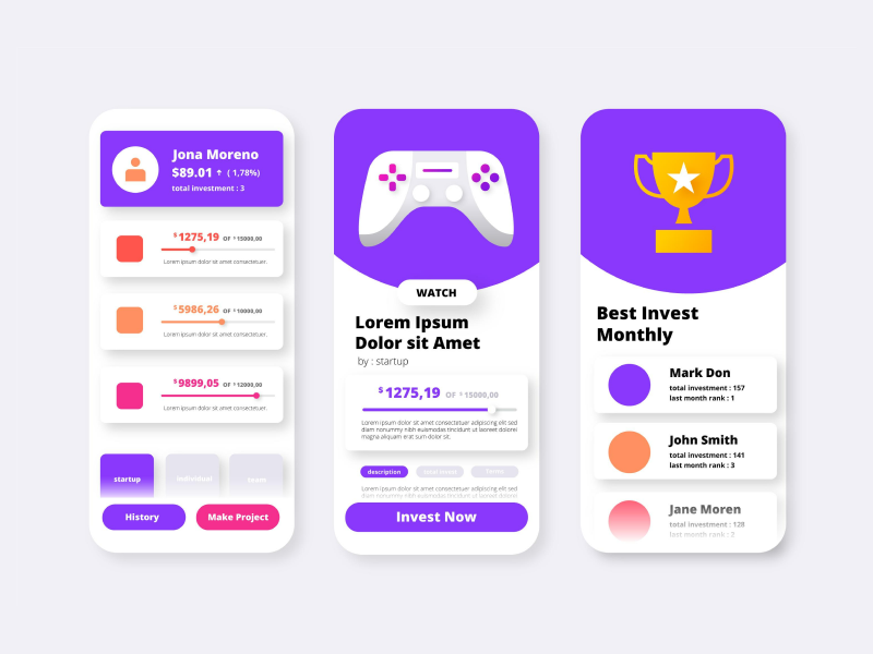
3. Product Cards
This type of card is commonly used in products and services. Its appearance is intuitive – it is formed by framing a visual element, the product, using input fields for price, title, ratings, and any additional information needed. Even more so, product cards help increase selling, by having elements that trigger FOMO and CTAs.
4. List Cards
Having an organized music library is a must-have in all of our lives, and list cards are the solution for us. In most cases, it’s easier to recognize your favorite jams by their cover. Some may even argue that list cards are the greatest update that happened since Walkman! When designing list cards, the focus should be on the title, subtitle, and image.
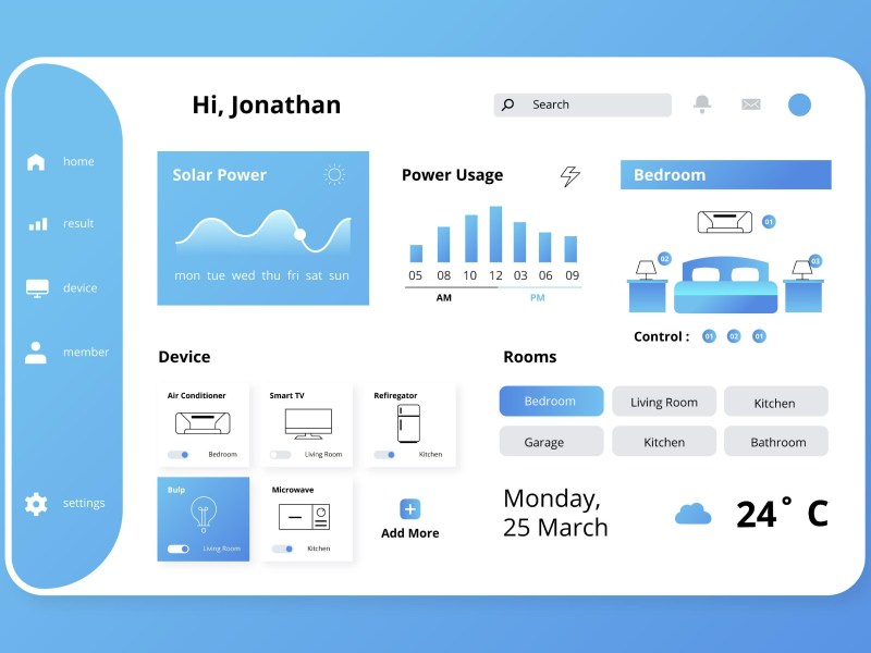
5. Data Cards
Typically used to display more complex content. Data cards are used in finance, banking, and even when you track your activity, as they can support dashboards, graphs, and any enterprise design.
6. Property Cards
Cards can also be used as property cards, as they provide a suitable environment to input location, listing title, description, rating, CTA, the pricing of the estate or property, and the visual element that the content is built around.
Each design comes with a purpose, and cards can help you accomplish that goal. Whether you want to deliver your goods or services, or if you are scrolling through your favorite online streaming services, cards are always there. So, make sure you choose the right ones when designing your project.
We at uinkits understand the importance of cards in great user experiences and creating amazing UI designs. That’s why we’ve developed a Figma UI Kit with design components that include these essential UI elements that enable you to design intuitive and user-friendly interfaces effortlessly.
“You press the button, we do the rest,” – Kodak.
Inspired by this iconic tagline from Kodak, we believe in simplifying the design process for you. Our Figma UI Kit, uinkits, is a complete design system with UI components that allows you, as a UI UX designer, to create your products as quickly as pressing a button.
Our design system includes components, icons, variables, cards, buttons, and everything you need for your design process. All you have to do is take your UI design component needed, and you’re ready to use it in your designs!


