First impressions can make or break a potential match.
A race against time begins whenever a visitor enters a web design. The goal of the race is to successfully advertise, spread information, give directions, and even relate to specific content. No matter the subject, most web pages, web designs, and apps will contain some type of endorsement or prominent message concerning optional actions. In the digital world, these endorsements usually come in the form of banners. These UI design elements are similar in nature to real-life billboards, in the way they are meant to capture the attention of the viewer.
Banners love to be at the center of attention. Unsurprisingly, they also tend to get the biggest amount of clicks when it comes to websites. Depending on our wishes, we can either choose to address or dismiss these banners. However, our goal should be to attract as many interactions as possible.
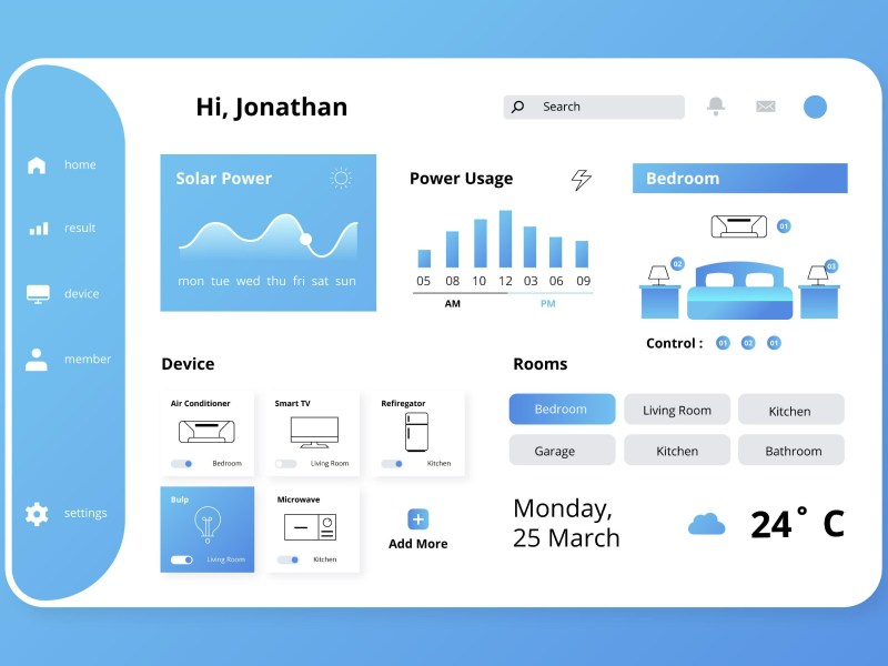
The banner is an essential digital design component that displays important and brief messages targeted toward users. The strategy is to position the banner UI design element in highly visible areas. It usually occupies the entire width of the top of a page or of the mobile phone screen. We are presented with a choice between following the initial purpose of the banner or dismissing it. No matter what we pick, we need to perform an action.
As the main goals of a banner in design are to transmit crucial information and advertise products to our users, it is highly important to only display one banner at a time. Although it might be tempting to send out as many messages to our users, we should avoid overcrowded and convoluted pages.
1. Visuals
Did you know that the human brain processes visual data 60,000 times faster than text?In such a fast-paced world it has become increasingly difficult to keep users engaged. The visual aspect of a banner is what our visitors will notice before they even get to the written content. That is if they will even get to that part.Besides an aesthetic purpose, the graphic design of a banner must convey the message we want to send out. For example, if you are selling toothpaste, you should show people who have desirable white teeth. There is a strong symbiotic relationship between the graphic design of a banner and its body of text. A high-quality visual that correctly utilizes color theory and regards its target audience could really amp up the performance of a banner.
2. Container
Another principle of designing UI banners takes care of the way we choose the container. This particular element of banners is practically the box that contains all the other components that make them up. One of the most relevant aspects when designing a banner is to correctly choose its container colors. By choosing a certain shade or tone, we can convey a strong message and send a clear hint to our users about what they will experience on the page. Ranging from more severe messages to solely informative ones, the color of the banner needs to match its purpose.
- We usually use the color orange for warning banners because it is a very eye-catching color. Indeed, orange is the first color the human eye can see, which is why it is often used for warnings.
- Red is widely associated with errors. Just as we associate red with mistakes, this color will signal that something went wrong or that the user was denied access to something.
- The color green has been synonymous with positive actions and outcomes. We should generally choose shades of green for banners that provide a positive and affirmative reaction to an action performed by the user.
- Blue is usually the best choice for banners that display an offer or a promotion meant to improve the quality of the user experience. Besides being associated with trustworthiness, traits such as loyalty and stability are often attributed to this color, making it suitable for such banners.
- Dark blue is one of the more neutral colors; this makes it very suitable for the design of authentication banners. Moreover, it is easily distinguishable from other stronger colors due to its neutrality.
3. Text
Copywriting is one of the essential principles of designing successful banners. The body of the banner should be brief, and straight to the point, and we should strive to convey the message in its simplest form. There is no need to get wordy when designing a banner. Because we have elements such as visuals that already empower our message. It should, above everything, provide a clear answer to the question "What is my purpose?".
Our users have to be able to quickly pick up on what we are trying to communicate through our banner. Language is a key component to this and for advertising banners it should always have the target public in mind. Even if we are referring to banners that are meant to signal warnings or errors, we have to adapt the vocabulary for the type of visitors we tend to attract to our page. One tactic of writing copies that is slowly declining is the heavy use of buzzwords. Users have been overexposed to bombastic phrases and using them now makes your website seem deceiving and not trustworthy more than anything. A better strategy for writing copies is to focus on informing visitors about the benefits, rather than selling ideas that sound too good to be true.
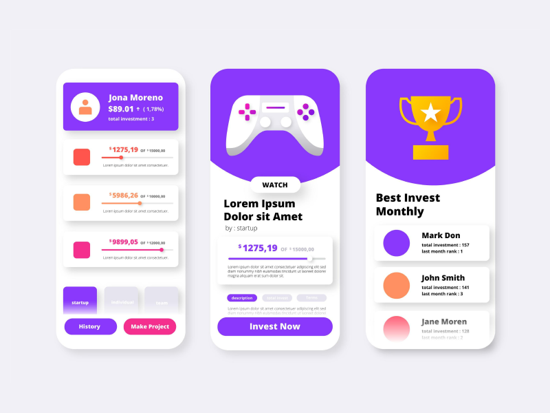
4. Call to Action
This element of the UI banner takes the form of inviting users to the specific actions you expect from them. They can be related to various things, from directing visitors to buy your product to refreshing a page in the case of an error, to requesting information from users. In the case of advertising banners, the main role of the CTA is to act as a bridge between the banner and the conversion rate. Similar to the text of the banner, the call to action must make it obvious to your user about the end result of clicking on it.
Because they are additional to the initial content, they should be as short as possible, ideally up to three words. Some common examples of CTAs are: Subscribe, Buy Now, Learn More, and Sign Up.If we want to design a good call to action we should mind the shape of the button and make it stick out. Then we should select a color that will not fade out with the background visuals and create contrast. The font and size should complement the rest of the text information while keeping a clear distinction between the two. Lastly, we should choose a suitable placement for the button so our users are tempted to press it.
We at uinkits understand the importance of inputs in great user experiences and creating amazing UI designs. That’s why we’ve developed a Figma UI Kit with design components that include these essential UI elements that enable you to design intuitive and user-friendly interfaces effortlessly.
“You press the button, we do the rest,” – Kodak.
Inspired by this iconic tagline from Kodak, we believe in simplifying the design process for you. Our Figma UI Kit, uinkits, is a complete design system with UI components that allows you, as a UI UX designer, to create your products as quickly as pressing a button.
Our design system includes components, icons, variables, cards, buttons, and everything you need for your design process. All you have to do is take your UI design component needed, and you’re ready to use it in your designs!


