Gestalt’s theory of perception explains how the human eye perceives elements as a unified whole rather than a collection of individual objects. In fact, our brain possesses a remarkable ability to complete missing information in an image, and it naturally seeks patterns and connections.
We can also apply this theory to the world of UI/UX design as well! When we look at a specific platform, we don’t perceive the elements as disconnected entities because they are organized so that they make sense together. And the navigation bar in UI/UX design is what puts the product together.
What is A Navigation Bar?
If there’s one thing that we can all agree on, it is that every platform needs a way for our users to switch from one page to another. And this is where the navigation bar comes in! As the name suggests, the navigation bar is basically a list of links that help our users navigate our platform.
The navigation bar can either be placed at the top of the page – horizontal navigation – or on the side of the page – vertical navigation.
In the context of web design, navigation bars often contain links to different pages, categories, or areas of the website. They can also display menus, search bars, social media links, advertisements, and other content. On the other hand, in applications, navigation bars help our users navigate between different views or functionalities. They can host icons, buttons, or text links representing specific actions, settings, or categories relevant to the app.
Why Do We Need a Navigation Bar?
Imagine going to a store looking for a shirt. But there is a slight difference from other regular stores – there are no signs. No visible aisle markers, no department labels, and no clear product category indicators. In other words, there’s no way to know where to begin and where to go. Just a lot of customers wandering around, feeling as lost as you are.
Well, this is what we would have to deal with if they landed on a platform with poor navigation. Just like a map, a navigational tool includes links to our website’s important categories and subcategories (if necessary) of our website. A navigation bar tells our users where they are, where else they can go, and what can be done there, providing a clear direction for our website design.
Think about it! When users encounter a clear and intuitive navigation system, they are more likely to stay engaged, explore different sections, and achieve their goals effortlessly. So, it isn’t even worth creating an aesthetically pleasing design if our users struggle to navigate it. But with a Navigation Bar, everything works perfectly together and complements each other.
So, we know that we must include a navigation bar. But which one is more fitting for our design? Vertical navigation or horizontal navigation?
Let’s explore!
What is Horizontal Navigation?
A horizontal navigation bar is a responsive row placed at the top or the bottom of a screen. Horizontal navigation bars are usually used in designs specifically for desktop screens for websites and desktop applications. Indeed, they are a prevalent feature across many websites, serving as a staple of navigation for these platforms - called headers. But horizontal navigation bars can also be found in mobile apps designs in the form of a bar at the bottom of the page – called a Navbars.
Why Should We Use Horizontal Navigation?
Whether it's a header for a website design or a Navbar for a mobile design, why should you introduce a horizontal navigation?
Horizontal Navigation Bar Pros
- The left-to-right sequence is natural to English speakers.
- It saves space and focuses more on the content page.
- Users are already accustomed to this layout because it is a typical design pattern, making navigating and finding information easier.
- Ensures that it's one of the first elements users see when they land on a webpage.
- Users can access navigation items without scrolling, reducing the effort needed to explore different website sections.
- Since the space is limited, UI/UX designers must be more mindful of the words they use. And while this might sound like a disadvantage, the horizontal layout allows for clearer labels.
- Suitable for mobile applications.
Horizontal Navigation Bar Cons
- Limited space, so we can’t have many navigation items.
- The linear arrangement might not be as effective for showcasing hierarchy.
- On mobile devices, the responsive design will make it a drawer/hamburger menu – which can hide navigation options and add an extra interaction step.
- Some navigation items might require a hover interaction to reveal additional content, such as submenus or tooltips.
40% OFF
Only this December
Upgrade to UI PRO version of Uinkits Systems to unlock 23.000 UI components.
Use the code "DEC40"
What is Vertical Navigation?
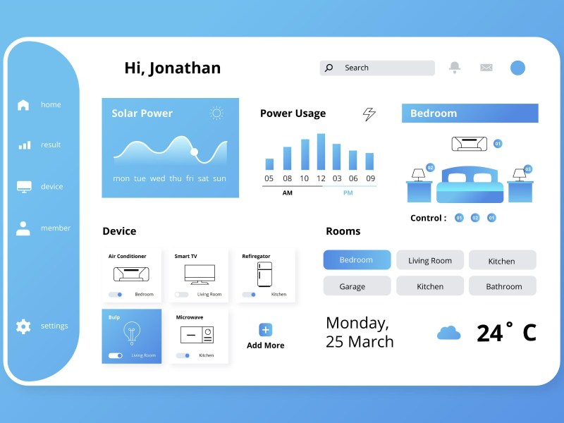
A vertical navigation bar is a responsive menu placed on a screen's sides – left or right. We can use two navigation tools to implement a vertical navigation bar: sidebars or navigation rail.
Sidebars are fixed or rearrangeable columns that are commonly used in projects specifically designed for desktop screens. In fact, sidebars have become a trend in desktop applications, as they give a clearer and more organized look. At the same time, these sidebars can also be considered drawers, which are hidden navigation elements that slide in from the side or bottom of the screen when activated – whether by click or hover.
On the other hand, navigation rail are UI elements found in medium or large layouts and can support up to 7 navigation items. Compared to sidebars, these navigation rail elements are always in the exact location – even when going from different screens within an app.
Why Should We Use Horizontal Navigation?
Whether it's a sidebar or a navigation rail, why should you add a vertical navigation in UI/UX design?
Vertical Navigation Bar Pros
- Vertical navigation is easier for the human eye to scan.
- This layout allows for more items without causing visual clutter.
- The vertical arrangement naturally supports the showcase of hierarchical relationships between navigation items. Subcategories and nested menus can be displayed more clearly, aiding users in understanding the site's structure.
- Vertical navigation bars translate well to mobile devices as they align with the natural vertical scrolling gesture.
- With more vertical space, you can use descriptive labels that provide users with a clear understanding of the content in each section, reducing confusion.
- Suitable for desktop applications.
Vertical Navigation Bar Cons
- Takes up a ⅓ of the page space – space that we could use for valuable content.
- Might not be as immediately noticeable as a top horizontal bar.
- On mobile devices, it will become a drawer/hamburger menu – which can hide navigation options and add an extra interaction step.
- If we have an extensive list of navigation items, the vertical layout could result in a long scroll.
Vertical Navigation vs. Horizontal Navigation
Indeed, both vertical navigation and horizontal navigation achieve the same goal – to help our users access the relevant content much easier. But which one is better for my design? Here is a side-by-side comparison of the differences between the two navigation bars to help you make a choice:
- Layout:
Horizontal Navigation: Row
Vertical Navigation: Column
- Position:
Horizontal Navigation: Top or bottom of the screen
Vertical Navigation: To the left or the right of the screen
- Number of Items:
Horizontal Navigation: Suitable for shorter lists
Vertical Navigation: Suitable both for shorter and longer lists
- Space Utilization
Horizontal Navigation: More widespread than vertical navigation
Vertical Navigation: It might cause visual noise
- Readability
Horizontal Navigation: The left-to-right sequence feels natural
Vertical Navigation: Might need scrolling
- Device
Horizontal Navigation: For mobile applications and websites on desktop screens
Vertical Navigation: For websites on desktop screens and desktop applications
- Consistency
Horizontal Navigation: Requires careful design to maintain consistent spacing and alignment
Vertical Navigation: Maintains consistency due to vertical arrangement
- Responsive Design
Horizontal Navigation: It can be challenging to adapt to smaller screens
Vertical Navigation: Generally adapts well to various screen sizes.
- User Behaviour
Horizontal Navigation: Users may overlook items if there are too many
Vertical Navigation: On mobile, the vertical navigation bar becomes a drawer, adding another step in the UX
As UI/UX designers, we must keep in mind that the choice between vertical navigation and horizontal navigation depends on user behavior, screen size, content hierarchy, and design goals. Each type has its own advantages and considerations, so the decision should be aligned with the specific requirements of the platform.
uinkits – Our Figma Design System and UI Kits
We at uinkits understand the importance of inputs in great user experiences and creating amazing UI designs. That’s why we’ve developed a Figma UI Kit with design components that include these essential UI elements that enable you to design intuitive and user-friendly interfaces effortlessly.
“You press the button, we do the rest,” – Kodak.
Inspired by this iconic tagline from Kodak, we believe in simplifying the design process for you. Our Figma UI Kit, uinkits, is a complete design system with UI components that allows you, as a UI UX designer, to create your products as quickly as pressing a button.
Our design system includes components, icons, variables, cards, buttons, and everything you need for your design process. All you have to do is take your UI design component needed, and you’re ready to use it in your designs!
By
Cristi Fonea
•
April 24, 2024


