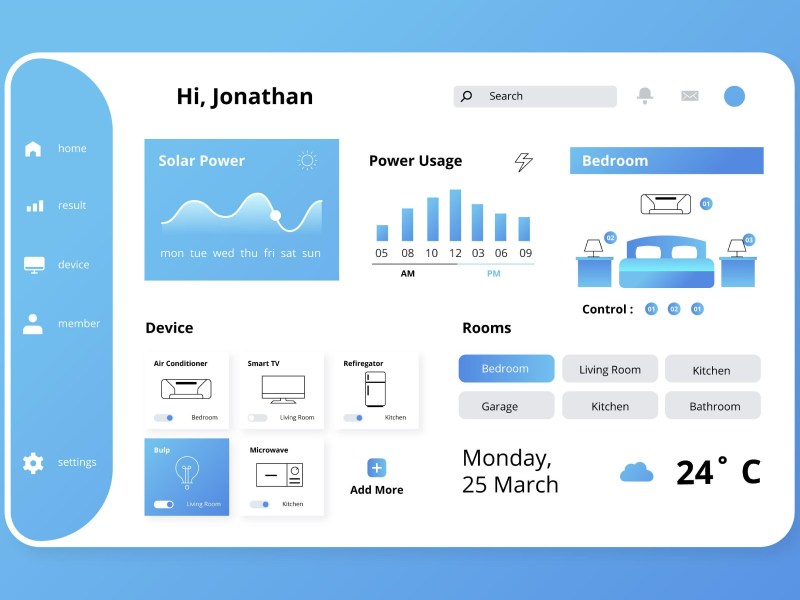
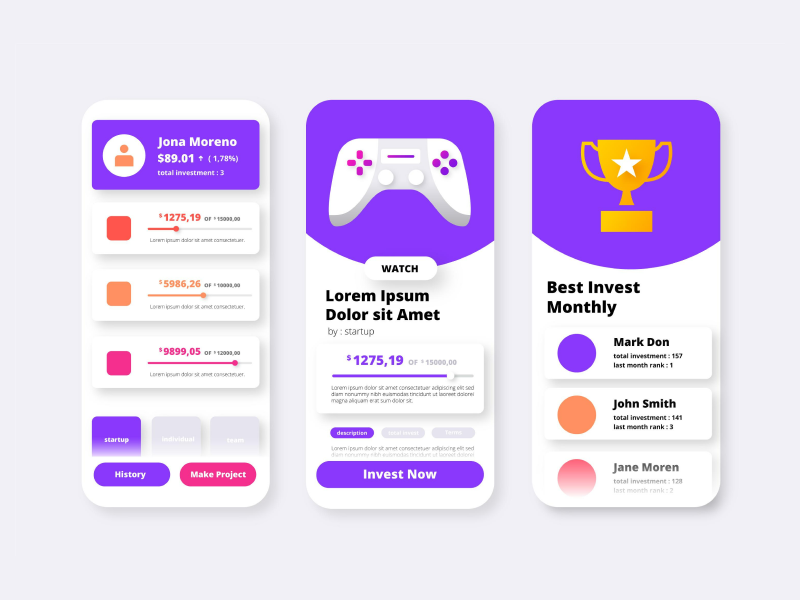
Every field has its own specific terminology. And UI UX design, or more specifically UX design, isn’t any different from this rule.
The creation of app design, websites, or even software platforms entails an essential amount of collaboration between UX designers. We cannot just start a UI UX design project and assume that everyone will work on their part and the product will meet the desired expectations. Instead, a great deal of discussing, comparing, and compromising needs to be done. This means that all people involved need to express themselves using a common vocabulary.
Besides the collaborative work that occurs in a team of UX designers – which, of course, in this context, is the most important – many other aspects of digital design involve the use of specific terminology. From job applications to interviews to online articles and posts, all the way to networking events. Whether you are an aspiring designer who is just diving into the industry or a senior UX designer with a lot of experience, we should all be accustomed to the digital design vocabulary. But let’s start from the beginning!
When thinking about what UX design is, the first answer should be what it stands for – User Experience. And as the name implies, it represents the experience our users have when interacting with us. UX design is all about making sure that when someone uses our products, apps, services, and so on – not only do they like what they are seeing – the visuals – but it’s also fun and easy for them to understand how to use it.
UX design is also about mastering the art of understanding the needs of our audience. User experience represents the relationship between our users and our products. Can they use it easily and efficiently? Do they feel excited when using it? Well, yes, they should. But maybe there were times when you did not understand where to find a specific section on a website. That’s not your fault – not you as a user, at least.
For example: Let’s say you’re shopping online for clothes. How easy is it to find that blue T-shirt you really want? Does the checkout process give you a headache? Or is it straightforward? All of these represent the user experience.
A UX designer's purpose lies in creating easy, efficient, fun, and logical flows. All of these are in order to leave a positive impression when it comes to functionality so that our users can complete the entire customer purchasing cycle. But to achieve all these, we must also understand what our customers want. Their wishes. Their wants. And most importantly – their pain points with their current products.
In order to help you out with this, we have compiled a list of the main UI UX design terms all of us, as designers, should know to understand the UX vocabulary. Especially if we want our customers to have a great user experience on our platform.
- User Experience Design
You might’ve expected this, but probably the first term you should be familiar with as a UX designer is…well, yes, user experience design. This is the process of creating and refining web products to craft meaningful and relevant user experiences. Many aspects fall under user experience design, from branding to usability to functionality.
- User-Centred Design
Another essential term used in the UX design industry is the approach of designing products that cater specifically to user needs. User-centred design is regarded as a critical principle for any UX designer, as it provides website, platform, and app design with the characteristics of appealing to user preferences and patterns.
- User Interface
It is not by mistake that we generally see UX alongside UI because they depend on each other. The user interface component refers to the aesthetic design of the visual elements of a digital product. UI has two main goals: to enable users to control a device successfully and to provide them with feedback when they initiate an interaction.
- Accessibility
Accessibility is another very important term in the UX vocabulary. It is the trait of a UX design to appeal to particular user needs. This is usually associated with people with disabilities, most commonly related to hearing or sight impairments. Some of the summon practices in connection to accessibility are making sure that color contrast meets WCAG. 2.0 standard and the addition of explanatory text for images and links.
- A/B Testing
Both UX and UI designers use this helpful method to compare two versions of the same project. A/B testing works on a simple principle: users are asked to choose between the two options of your online content. This is a proven good marketing strategy as you directly request feedback from your target audience to determine what design solutions are more appropriate for them.
- Breadcrumbs
Breadcrumbs are a secondary navigation element that helps users accurately track their location on a webpage. It is usually positioned at the top of a page to be easily noticeable. Breadcrumbs are very common in UX design because they constitute a quick strategy for simplifying users' navigation.
- Wireframe
Wireframes are simplified versions of our websites. Their main purpose is to help us analyze the elements that are more important in our design. It is pretty difficult to imagine the design process in the absence of wireframing because it is instrumental for our organization. Also known as page architecture, wireframes must include all the essential UI design components of the finished product.
- Prototype
A common misconception is that wireframing and prototyping are the same thing. However, this is far from the truth. Prototypes are preliminary models of the final product, which are richer in detail than wireframes. If wireframes are developed in the early stages of a design, we would only get to prototyping later on in the process. Prototypes can take various forms, from sketches all the way to fully utilitarian digital models.
- Persona
Creating user personas is a strategy borrowed from marketing but is just as useful in UX design. This entails that we construct a comprehensive profile that should mimic our users. A user persona usually includes details such as the age, occupation, gender, and hobbies of our visitor. Most UX designers create multiple personas because their visitors can be quite diverse.
- Mockup
Mockups are realistic representations of what the final product will look like. The difference between mockups and prototypes is that the first ones must look identical to the finished design. The main purpose of a mockup is to visualize and test out a design before its actual release.
- Call-To-Action Button
Call-to-action is a term that indicates a short phrase or even a word that is meant to persuade the user to interact with the website or app in one way or another. We will usually encounter call-to-action elements in UX design in the form of buttons, links, and tabs which allow users to perform the action we intend for them,
- Responsive
This is one of the most important characteristics to consider in the case of UX creation. Responsiveness refers to the ability of a webpage to adapt to the different devices it is accessed from. Due to the diversity of the tech market, it is essential that we craft responsive designs to cater to larger audiences. This factor is ensured by adjusting, shrinking, and stretching the interface for various screens.
- Usability Testing
As the name suggests, usability testing is commonly used in UX design to test out how easy it is to use a product. The usability tests are conducted with our users in order to gather valuable feedback on our website or app. During these examinations, we can either showcase our project's sketches or prototypes of the almost finalized product.
- Storyboard
As UX designers, we use storyboards to visualize how our users interact with the website or app. Using a storyboard may make it easier to empathize with our users because it offers us insight into their behavior patterns. There are generally two types of storyboards based on quality, which we would implement based on our situation - high fidelity and low fidelity.
- Design Thinking
Design thinking is a strategic 5-step method of overcoming various challenges in the design process. The five steps of design thinking are:
- Empathize
- Define
- Ideate
- Prototype
- Test
Indeed, UX design is a very complex field that requires extensive research. However, getting accustomed to the basic terminology is a really good starting point for everyone willing to break into the digital design industry.
We at uinkits understand the importance of great user experiences and creating amazing UI designs. That’s why we’ve developed a Figma UI Kit with design components that include these essential UI elements that enable you to design intuitive and user-friendly interfaces effortlessly.
“You press the button, we do the rest.” – Kodak.
Inspired by this iconic tagline from Kodak, we believe in simplifying the design process for you. Our Figma UI Kit, uinkits, is a complete design system with UI components that allows you, as a UI UX designer, to create your products as quickly as pressing a button.
Our design system includes UI components, icons, variables, cards, buttons and everything you need for your design process. All you have to do is take your UI design component needed, and you’re ready to use it in your designs!


