Typography is everywhere and it will continue to surround us regardless of the palace and time. And since the first typeface was used in the early 15th century, typography and the way we design and mimic calligraphic text evolved, and have been interpreting our messages ever since.
Even more so, we can dig a little deeper and discover that although we might think typefaces are relatively new, the truth is that it existed ever since human beings wanted to share messages and leave their words for the next generations.
Everywhere we look, from billboards on the tall buildings of our cities to our cereal boxes, the font is one of the first things we notice in any UI design – whether we realize it consciously or not.
In UI UX design we can use different fonts to send a specific message. Fonts, typography, and typefaces carry more meaning than we think.
“You can say, ‘I love you,’ in Helvetica. And you can say it with Helvetica Extra Light if you want to be really fancy. Or you can say it with the Extra Bold if it's really intensive and passionate, you know, and it might work.” - Massimo Vignelli, famous Italian designer.
However, as UI UX designers, when starting a new Figma project, we sometimes might make mistakes that we don’t realize. As Ellen Lupton named them, there are some “type crimes” that we might need to double-check before getting our Figma files ready.
So, to help you avoid those mistakes I came up with a set of typography principles you should take into consideration before moving forward with your web or app design. But first, you should be aware of the difference between a typeface and a font.
Both of these terms are related to UI design and get mixed up by people who are not very familiar with the field. This confusion stems from the fact that the words tend to be used interchangeably. The simplest way to understand the difference between these two is that typefaces are collections of fonts. On the other hand, fonts are related to specific styles or weights that are part of a typeface family.
Basically, fonts are graphical representations of a text character.
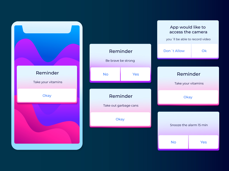
Texts can become annoying sometimes. Integrating, choosing the right fonts, and staying up-to-date with the latest trends when it comes to typography can get challenging. But, as with any UI UX design element, keeping your design accessible and making sure the user experience is flawless is mandatory. So, paying more attention to the consistency of the texts you are incorporating in the web or app design is an important aspect.
I am sure we all have been in a situation where we were designing cards and suddenly we realize that some texts are more lengthy than others. But, Figma somehow knew that this situation was draining all designers out of their energy and came up with a solution – truncation. It’s easy to use and it helps you get the job done more efficiently.
Line–height matters. When creating a project manually selecting and changing the line height, even with only a pixel value can get annoying really fast. But, the nightmare was put to an end by the latest update that Figma has made. We now have the ability to set the percentage of our line height and be sure we have the perfect design.
Functionality will always come above all in a UX UI design, and I am certain we can all agree that there are some key moments in a user’s experience when we should keep this advice in mind. Think about when planning a vacation – where you are going to stay is a big part of the project. But, online booking sites already know this. So, they design checkout sections where the values and the dates are upfront.
In this case, functionality is not matched by the visual aspect of the page. And, Figma came up with a solution that helps us optimize and monospace the charatheres on the baseline.
When choosing a typeface this doesn’t necessarily mean that all characters will be as we would expect them to look like. Some might come with bizarre double-story characters and be hard to interpret, having the focus on the design rather than the functionality of the design.
Hanging punctuations are what we need to pay attention to in any Figma project. But as you might have guessed already, Figma took care of it.
No matter how visually beautiful a font is, it has failed its purpose if it is hard to read. It is not surprising that fonts such as Times New Roman are among the most popular - they are easy to read regardless of the context they are placed in.
If you are not sure whether the font you want for your UI design is legible enough, you can conduct usability tests for your app or website design that are focused on the fonts. Another helpful practice is simply researching other websites that use the same or similar fonts.
We at uinkits understand the importance of great user experiences and creating amazing UI designs. That’s why we’ve developed a Figma UI Kit with design components that include these essential UI elements that enable you to design intuitive and user-friendly interfaces effortlessly.
“You press the button, we do the rest.” – Kodak.
Inspired by this iconic tagline from Kodak, we believe in simplifying the design process for you. Our Figma UI Kit, uinkits, is a complete design system with UI components that allows you, as a UI UX designer, to create your products as quickly as pressing a button.
Our design system includes UI components, icons, variables, cards, buttons and everything you need for your design process. All you have to do is take your UI design component needed, and you’re ready to use it in your designs!


