

Colors have the power to change a design. With the integration of colors in a UI UX design we have the ability to offer it a different meaning and entertain a certain atmosphere of the design. Based on the colors we choose for our web or app design, we can create a playful or more elegant design. We can mimic reality, or we can choose to paint however we want. So, how do we choose our color palette for our UI UX design project?
Types of Color Palette for UI/UX Design Projects
When starting out a new project, we need to be mindful of not only the primary color palette but also the appropriate accent colors, as well as semantic and neutral color palettes.
1. Primary colors
The primary color palette is not the color palette you encounter the most in a design. Usually in a UI design, you will be using the most neutral color palette that is made out of shades of white, gray, black, or brown. The neutral color palette occupies the majority of the design as it is used for background color, the primary colors coming on top of them as pops of colors. Even more so, according to the 60-30-10 rule, the primary color palette occupies the least in the design, 10%. The majority of the design is a neutral color palette – 60%, while 30% is occupied by the secondary color palette, and the rest of 10% is the accent.
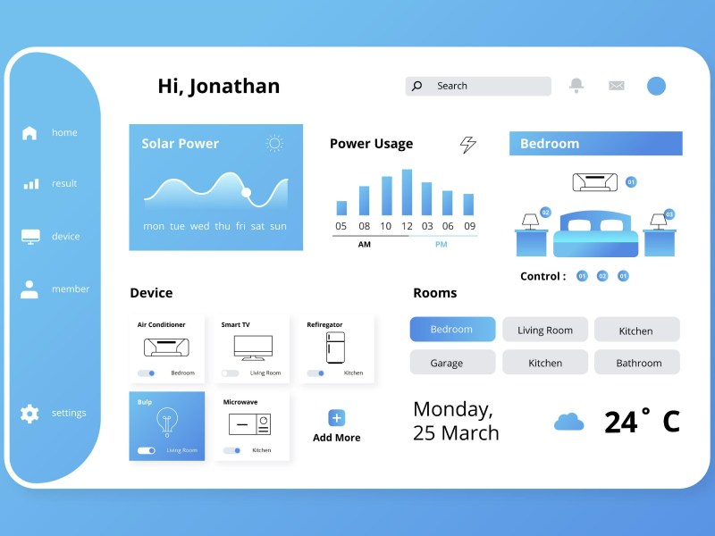
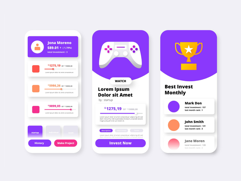
As UI designers, we typically use primary colors for our design elements. Buttons, progress bars, sliders, links, selections, and other design elements are usually designed using primary colors. Those design components are generally the ones that need to pop up and draw attention to.
After you have chosen your primary color you can extract your accent color palette and semantic color palette with the use of a color wheel combination.
2. Secondary accent color
When we chose our primary colors, we also chose our secondary color palette. This one is used to communicate different information to the users, such as a new feature that is now available or a price decrease.
3. Semantic colors
Semantic solar palettes are the colors that we use to indicate the state of our company. They can be used to indicate warring when an input is completed wrong or right. Colors such as green, blue, yellow, or red can indicate when a successful action has been completed, when we are waiting for an action to occur, or even when destructive information has taken place.
4. Neutrals
Neutral color palettes are the colors we use for our background or for the large spaces in our web or app design. In the neutral color palette, we can encounter white, black, brown, beige, or gray which are a must-have in a UX UI design.
When starting out a new project, choose your color palettes carefully, and don’t forget that each color carries meaning and that we can share messages only through the colors we choose. Even more so, when choosing the right colors for your design, keep in mind that neutral colors will occupy the majority of your design, as the primary color will be the pops of color the potential viewers will keep in mind when seeing your UI design.
Color psychology also plays a great role in your web or app design. Colors such as red or green can be interpreted as wrong or right but also mean power, creativity, or earthiness.
So, choose colors that fit your design best and carry the message you want your app or web design to have.
Uinkits – Our Figma Design System and UI Kits
We at uinkits understand the importance of amazing color palettes in great user experiences and creating cool UI designs. That’s why we’ve developed a Figma UI Kit with design components that include these essential UI elements that enable you to design intuitive and user-friendly interfaces effortlessly.
“You press the button, we do the rest,” – Kodak.
Inspired by this iconic tagline from Kodak, we believe in simplifying the design process for you. Our Figma UI Kit, uinkits, is a complete design system with UI components that allows you, as a UI UX designer, to create your products as quickly as pressing a button.
Our design system includes components, icons, variables, cards, buttons, and everything you need for your design process. All you have to do is take your UI design component needed, and you’re ready to use it in your designs!
40% OFF
Only this December
Upgrade to UI PRO version of Uinkits Systems to unlock 23.000 UI components.
Use the code "DEC40"


