Since our evolution over 4 million years ago, humans are constantly creating. Society is bringing to life concepts that we didn’t even think would exist. If you would ask your grandparents if they ever imagined smartphones or something similar to them would ever exist, their answer would probably be no. Think about how far technology has come over the past two decades, how far we’ve come, and even if we can’t imagine what is to come.
How would you have thought 60 years ago that if you have no idea how to cook or if your work is keeping you occupied 24/7, you would have the option to open your phone, scroll down to menus from your favorite restaurants, and have them delivered to your doorstep in no time? Well, our ancestors would probably be laughing when seeing how easy surviving has got. No hunting, no looking for shelter, just our obsession with technology.
Humanity learned how to adapt and how to accept digitalization without questioning it. When we heard about driverless cars or electric cars we were excited to see if they work. When a new smartphone is released, we want it - we desire to be up-to-date when it comes to technology. So, web designers need to be delivering the right product to us in order to have a great user experience.
How Did It All Start? History of the Web Design
But what exactly is web design? To get a better understanding of this matter we need to get back down memory lane and see when the first site was ever published. And for those of you who are now surrounded by technology, it might be hard to remember or imagine how our society looked before 1991 when the first site was published. Today we have over one billion websites on the internet, and I can’t even imagine what one single website available would look like.
As you might imagine, it looked nothing like websites do today. It was a blank page with no animations, no color, no special fonts, no nothing. The only information being delivered to its users about how a website can be created and what is the purpose of the World Wide Web project. It was life-changing. Tim Berners-Lee did just that, he created a space where ideas can be shared and known by every user, a collaborative space where you can communicate and learn together. Tim Berners-Lee was the pioneer of what we now call an online community where, as he put it:
“Data is a precious thing and will last longer than the systems themselves.”
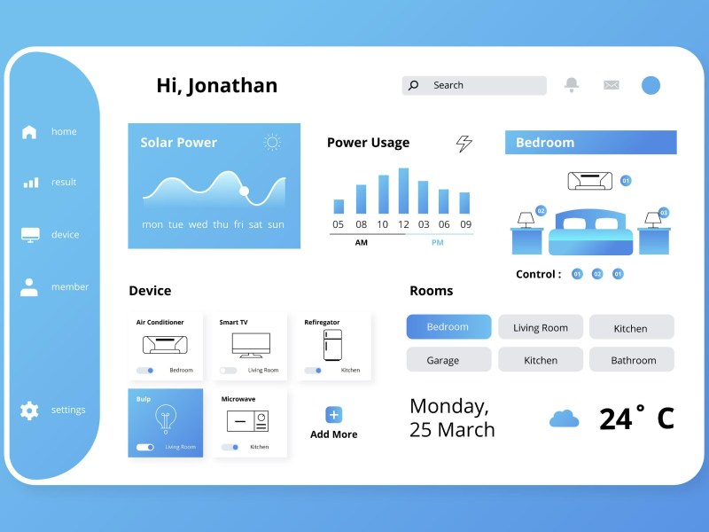
But, getting back to what exactly web design means, imagine it as a book. Users can see the cover of it, but the UI UX designer is the one who writes the pages and knows how they should act in certain situations. Every button, card, dropdown, or any other element is designed to look aesthetically pleasing while responding to the user's actions, all while being intuitive.
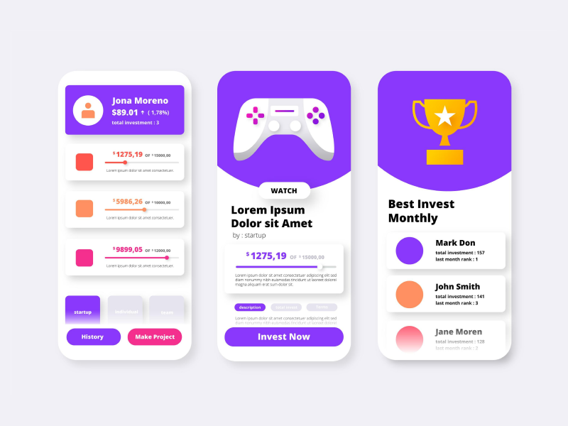
Nowadays, designs need to be functional, it needs to be deductible and deliver the right feeling to the user. Yet, web design is not all about your computer. Web designs also include mobile apps, web apps, and user interface designs.
First Web Design
After Tim Berners-Lee's creation in 1991, the World Wide Web Consortium was established in 1994. If you are new to the terminology, the World Wide Web Consortium stands for a set of rules that were created in order to build certain standards for the World Wide Web. Imagine a world where every site would create and use a certain code of rules when it comes to coding the site and having specific guidelines for its web technologies. I can’t even think what developers would have looked like. The World Wide Web Consortium helped us establish the creation of universal programming languages, such as Java or JavaScript.
After the establishment of the World Wide Web Consortium, Yahoo was launched in 1996. And, this time the web design had a little color. It was something new that included colorful icons but maintained a similar layout, having all the titles in one column.
But, designers wanted more, they wanted color and table-based design which offered them more options when it came to designing and choosing a layout. Once table markups in HTML were introduced, web designers saw the opportunity and they took it. Their design lacked structure and the focus was on endless texts which were hard to read and follow. So, when the introduction of tables-based design entered the game, designers took advantage and separated their content into more than one column. Nowadays all of this seems simple, but back then it was revolutionary for the evolution of web design..
40% OFF
Only this December
Upgrade to UI PRO version of Uinkits Systems to unlock 23.000 UI components.
Use the code "DEC40"
Introducing Spacer Gifs
With this change, designers basically placed small transparent spacer GIFs in between content, which created the illusion of structure but in reality, it was a table layout behind a sliced image background. But, as you would expect the design was all over the place, designers finally had the ability to play with their elements and so they did. And soon, animated GIFs and visit counters appeared and stepped up the designing game, completely changing what we knew about user interfaces - this proved as a crucial step in the evolution of web design..
It was a time when accessibility didn’t come first. UI UX designers place aesthetics over the user experience and SpacerGifs were used to cover the white spaces. That lasted until the late 1990s when in 1996 Flash was introduced and changed the focus to the user. With Flash a new world of design was discovered with the help of basic HTML. Flash brought a new approach to the design with neon colors, animations, splash pages, 3D buttons, and splash pages which till that day were never seen before.
The Late 1990s
It was a time of development and experimentation when great ideas were born. In the late 1990s, Amazon Books was launched alongside Apple.com. In this period of time, web-safe colors and fonts were introduced, and promoting language like JavaScript allowed designers to integrate animations and other dynamic elements into their designs.
After the introduction of complicated designs and colorful animation, came the time of less is more rule. This switched the focus to a more minimalistic approach that led to websites being more organized and user-focused. Websites lacked accessibility, which made the user experience hard and unpredictable.
Early and Mid-2000s
But the early and mid-2000s brought plenty of changes and advancements in the evolution of web design. An industrial revolution that made a lot of steps toward modern web design. In this time frame, designers started to create responsive websites that could be switched to different versions, such as tablets, desktops, laptops, and even mobile. Switching to an early approach of responsive web design. This period also marks the appearance of MySpace and Facebook which allowed users to express themselves and interact with each other, building up communities that grew bigger and bigger.
The Flat Design
Coming closer to the present, since 2010, we have the so-called flat design. Flat design became popular with the release of Windows 8, Apple’s IOS 7, and Google’s Material Design. It uses 2D icons, and clean, minimalistic, and bright colors, which can create the impression of real-life elements while delivering a clear and efficient user experience.
Flat design was created to deliver responsive designs that can increase the user experience. Their purpose is to help the user interact and create a deductible environment that has the ability to scale. A flat design can reduce visual noise, yet this design slowly switches to an almost flat design approach. And if you think more about this, it makes complete sense. For buttons to be clickable, we need to use shadows, and gradients and choose colors wisely.
Today
Nowadays, we have web designs that are interactive and focused on the user experience. We have accessible environments that have the purpose of creating deductible and scalable designs. Web designers have come a long way and are thinking like their users when making decisions that can impact the whole design process. We have a directional design, animations, micro-interactions, and many other approaches that can help us transform the design and make it tailored for our users.
Although web design has come a long way, we can never imagine what it will look like 30 years from now on. Technology is constantly changing and so does design. However, productivity is the aspect that will never change if we don’t keep up with the shortcuts technology is offering us. And, for designers, using a design system can make miracles by organizing the elements you need and helping deliver faster solutions to your clients.
A design system creates productivity and efficiency by developing elements that can be personalized and used by a designer or by everyone from a team. It creates accessible libraries that can store assets and be later used or integrated into a design. Design systems give you the ability to create a website or an app from scratch, only needing your personal touch when it comes to customizing your already existing elements.
uinkits – Our Figma Design System and UI Kits
We at uinkits understand the importance of great user experiences and in creating amazing UI designs. That’s why we’ve developed a Figma UI Kit with design components that include these essential dividing elements that enable you to design intuitive and user-friendly interfaces effortlessly.
“You press the button, we do the rest,” – Kodak.
Inspired by this iconic tagline from Kodak, we believe in simplifying the design process for you. Our Figma UI Kit, uinkits, is a complete design system with UI components that allows you, as a UI UX designer, to create your products as quickly as pressing a button.
Our design system includes UI components, variables, cards, and everything you need for your design are already ready, responsive, prototyped, and ready for usability testing. All you have to do is take your UI design component needed, and you’re ready to use it in your designs!
By
Cristi Fonea
•
March 22, 2024


