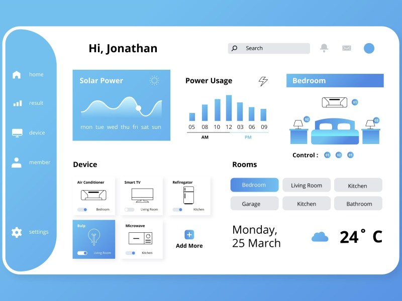
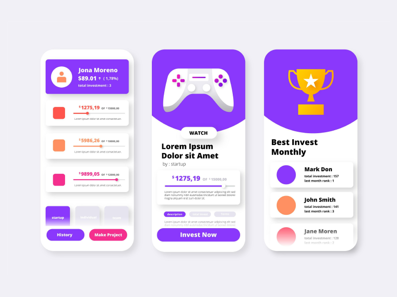
A famous product design analyst, Steve Krug, once said (and wrote a book about it) – “Don’t make me think.”
And it’s true! When we land on a new website, we should immediately know where to go next without having to put too much effort into it. Because of this, as UI/UX designers, we must create a product design so that our users can immediately find their way around without any confusion or frustration. And integrating Sidebars in our UI design is where this starts.
Think about it! Ask anyone to describe a basic layout of a website or a software platform, and you can almost guarantee that they will mention sidebars as well. And it’s no surprise! Sidebars have become an important part of UI design – especially in Software as a Service products (SaaS products). Even the most iconic websites have it – X (ex-Twitter), Facebook, and Instagram.
Indeed, not all product designs need sidebars. In fact, some of them are even better off without a sidebar, offering a cleaner and more focused interface. But lately, sidebars have become part of the essential components that we, as UI/UX designers, adopt in our product designs and website design. When these sidebars are really needed and strategically integrated into the UI design, they can significantly enhance the user experience.
Read on to find out what sidebars are, when to use sidebars, the advantages of sidebars and disadvantages, and how to use them in your website design. All while also understanding the difference between sidebars and drawers and the best tips to create sidebars. So, let’s get started!
As the name suggests, a sidebar is basically a vertical column placed to the sides of a digital platform’s interface that gives our users extra information. Its content and layout can differ from website to website and from platform to platform, but its main purpose is to complement the primary content and give our users a more accessible method of accessing relevant information.
Why Do We Need Sidebars? What Are Sidebars Used For?
Well, sidebars in design are used for navigation purposes as they provide easy access to various sections and functionalities of a platform. As UI UX designers, this is a great way to organize and present navigational key features, allowing our users to find and interact with the content they need quickly.
But that’s not all! These sidebars can also be used for advertising and marketing purposes. They provide space for showcasing ads of certain products, displaying email signup forms, introducing social media links, as well as featuring popular or related posts. For this reason, sidebars make the platform navigation much easier and facilitate effective user engagement for our business.
We’ve already established that sidebars are always on the side of the website design. Whether it is for a SaaS application, an e-commerce website, or on a simple blog article – we can always find these navigation bars on the side of the screen. But which side is better? Left or right?
While some UI/UX designers might not give a second thought to this question, the reality is that there is quite a big distinction between the two sides. And mostly because left sidebars and right sidebars are used for different purposes in design. We use sidebars for navigation reasons, as users can easily access categories, contacts, social media links, and other content. On the other hand, the right sidebar is where we display call-to-action buttons, links to sponsored content, and any other type of advertising or promotional content.
But let’s not forget that as users, we tend to look at the left half of the screen more than 80% of the time. So, left-sided bars are normally more attention-grabbing due to visual habits and user behaviour. However, right-sided bars can be considered much more accessible to the user, especially on certain platforms.
We at uinkits understand the importance of inputs in great user experiences and creating amazing UI designs. That’s why we’ve developed a Figma UI Kit with design components that include these essential UI elements that enable you to design intuitive and user-friendly interfaces effortlessly.
“You press the button, we do the rest,” – Kodak.
Inspired by this iconic tagline from Kodak, we believe in simplifying the design process for you. Our Figma UI Kit, uinkits, is a complete design system with UI components that allows you, as a UI UX designer, to create your products as quickly as pressing a button.
Our design system includes components, icons, variables, cards, buttons, and everything you need for your design process. All you have to do is take your UI design component needed, and you’re ready to use it in your designs!


