Navigation Bars are the UI design elements that stand as the fundamental building blocks for every mobile app, every platform, every website, and all other digital products we can think of. They form the structural architecture of every UI/UX design, providing our users with an intuitive experience.
Think of NavBars as a map for our digital product. With a single tap, our users can easily access different sections of our platform, go back to the main page, or navigate to specific features.
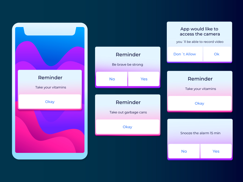
However, more and more UI/UX designers are creating NavBars without thinking about making a plan for our users or following specific guidelines. Look at the Medium iOS app! Yes, they also have a beautifully designed NavBar at the bottom. But as I was navigating through the app, we saw a flaw: the tab mysteriously disappeared when transitioning from the main page to the article view page.
So, it’s time to go back to the basics so that mistakes like this don’t happen to your design as well!
What are NavBars and How to Use Them?
NavBars or Navigation Bars are basically a group of menu items or icons created to allow our users to navigate through different sections of our platforms. This should always be in the back of our minds as we design these NavBars. In fact, these NavBars always answer these questions:
- Where are you? (Think about how many times you’ve clicked on something because it said “Home” or “Profile”)
- Where else can you go? (Maybe there are multiple tabs when you click on a specific tab.)
- What can you do here? (Are there options, actions, or features available?)
In other words, these navigation tabs give our users a sense of direction and purpose for our digital product, which is the core of a great user experience. And just like the signs you see in a supermarket – “Fruits”, “Meat”, “Bio”, guiding us to the section that we want, this is how NavBars should be thought of as well. As UI UX designers, we should design as if we are stepping into a new supermarket. Just like we would hate to get lost in a chaotic store, our users shouldn’t have to deal with confusion in our digital products either.
NavBar or Navigation Rail?
When developing a product, a navigational tool can be placed anywhere on the screen – at the bottom, at the top, and even on the sides of the screen, left and right. However, there is a slight difference when placing them.
Following the rule of thumb (quite literally), the classic NavBar is more commonly found at the bottom of the screen – especially when using a phone – as it is more accessible for our users to reach with their thumbs. However, the NavBar is no longer the standard choice on larger devices such as tablets, laptops, and even TVs. Instead, we often have the Navigation Rail, which offers users an even bigger range of tabs to select from. Sometimes, we can even find the Navigation Rail available for phones on certain websites as well. But it’s commonly known as the Hamburger Menu.
Types of NavBars
When it comes to what type of NavBars we need, the answer is simple: it depends. UI UX designers often have two main options to consider: Static NavBars or Dynamic NavBars. Both of these have different and unique benefits, but it’s always best to test them when designing.
The Static NavBar, as the name suggests, remains fixed at the bottom of the screen, maintaining its position constantly – whether we are switching between tabs or sections and even scrolling. This option is quite popular among large companies, with Instagram, LinkedIn, and Airbnb all using a Static NavBar in their user interfaces. On the other hand, although the Dynamic NavBar is also at the bottom, it hides when we are scrolling or switching between tabs.
40% OFF
Only this February
Upgrade to UI PRO version of Uinkits Systems to unlock 23.000 UI components.
Use the code "FEB40"
What are the Advantages of Using NavBars?
Although NavBars has become quite popular among all platforms, some product designers still ask themselves, "Should I use NavBars?”. And well, the decision is in your hands, based on your platform’s app or simple preferences. But there are many benefits of NavBars.
NavBars and Nav Bars are widely used in UX design as they are the backbone of every functional and good UI/UX design. Especially if you have a complex product – such as an online shopping website or a community-driven mobile app. NavBars makes our platform much more intuitive and allows users to navigate through our platform easily. Which, ultimately, makes the user experience much better.
The beauty of NavBars lies not only in their accessibility but also in their space-saving design. When placed strategically at the right place, as UI/UX designers, we can enable our users quick access to all the content they want while also categorizing the information according to their needs.
However, just because we can use NavBars doesn’t mean we should. The most important thing about NavBars is that we must use them wisely. Yes, they are excellent tools for accessibility and navigation, but we must understand the needs of our users first. Does my app really need a NavBar? Will my users actually need it? Sometimes, the answer is not really. In fact, there are many apps that don’t require a NavBar, like iOS Calculator or Uber.
What is the Anatomy of a NavBar?
But if we’re sure that we will need a NavBar of Nav Bar, to understand how to use it in our designs, we need to understand how it works. The good part is that the anatomy of a NavBar is simple:
- Active Icon: This icon usually sticks out from the group when “active” as it shows to our user that it is currently selected and answers the question of “Where am I”.
- Active Label: This icon represents the name of the Active Icon, and it works similarly.
- Inactive Icons: These icons are not selected and are usually more faded to let the Active Icon stick out.
- Inactive Labels: These icons are also visible, but they are just as faded as Inactive icons to indicate that they are not selected.
- Container: The element that houses all icons – both active and inactive.
Uinkits – Our Figma Design System and UI Kits
We at uinkits understand the importance of great user experiences and creating amazing UI designs. That’s why we’ve developed a Figma UI Kit with design components that include these essential UI elements that enable you to design intuitive and user-friendly interfaces effortlessly.
“You press the button, we do the rest,” – Kodak.
Inspired by this iconic tagline from Kodak, we believe in simplifying the design process for you. Our Figma UI Kit, uinkits, is a complete design system with UI components that allows you, as a UI UX designer, to create your products as quickly as pressing a button.
Our design system includes components, icons, variables, cards, buttons, and everything you need for your design process. All you have to do is take your UI design component needed, and you’re ready to use it in your designs!
By
Cristi Fonea
•
August 21, 2024


