Wireframes and prototyping are extremely important stages in UI UX design and product development – we already know that.
Why exactly? Well, prototyping helps us see exactly what our design will look like in real life. But what’s great about this is that it allows us to test our designs, identify any possible issues, get feedback on our ideas, and make iterations of our final product.
For this reason, when it comes to prototyping, there are two main ways to approach this: low fidelity prototype (or lo fi) and high fidelity prototype (or hi fidelity). So, what is lo fi? What is hi fidelity? What is the difference between low fidelity and high fidelity, and which prototype should be used? Let’s find out!
What is Low Fidelity?
Low fidelity prototype, or lo fi prototype, represents a simple prototype, such as transitioning from one screen to another. So, when it comes to what is lo fi, the answer is simple: it helps us see exactly how the app or website will work.
This is extremely helpful in understanding the path a user will take when navigating through a product design and showing our clients how the app or website design will look in real life. In other words, this is the first step in designing a product design, as it allows UI UX designers to analyze information architecture and create user flows.
For example, let’s say that you want to build a Finance app. A simple low fidelity prototype of a Finance app would look like this:
signing up >> introduce card >> make a transaction through the app >> and see the transaction reports.
Low fidelity prototyping can be developed traditionally through paper prototypes or, in a modern way, through digital wireframes. Paper prototypes allow us to visualize all the flows together and help us quickly iterate the navigation process as much as we need. On the other hand, digital wireframes are a basic digital representation of the layout of the screen and how they interconnect. If you’re using the Figma prototype, you can easily see the app or website mockup by creating connections between the frames and developing the navigation of your product design.
What is High Fidelity?
High Fidelity Prototype, or hi-fi prototype, represents the final iterations of the finished products, and, in some cases, it might even become the product itself. Using app or website mockups, colors, and other content, UI UX designers are able to add interactions, create animations, and other transitions to create a real-life user experience.
Hi fidelity prototypes allow for a detailed and realistic digital representation of the final UI UX design. For this reason, it’s crucial to have this level of fidelity, as it’s mostly necessary for testing the usability, functionality, and accessibility of the design before sending it to development.
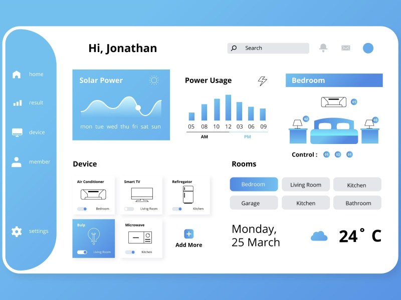
Going back to our example about designing a Finance app, a hi fidelity prototype would look like this:
Designers can include certain illustrations after users send a sum of money to someone or use colors when the amount of money is low.
So, when it comes to hi fidelity meaning, this can be developed through product mockups or using code if you want to go above and beyond. In most cases, and especially if you use Figma, UI UX designers will opt for an app or website mockup to see how their product looks and functions. However, there are some cases in which designers opt to use React to create high fidelity prototypes that look and function exactly the way the final product should.
40% OFF
Only this December
Upgrade to UI PRO version of Uinkits Systems to unlock 23.000 UI components.
Use the code "DEC40"
Low Fidelity vs High Fidelity Prototype
Lo Fi Prototypes are perfect in the early stages of the UI UX design process as we can sit down and map out how our product design should look. We can create prototypes from inspiration from other sources and even come up with multiple options for specific user flows before actually making the entire user interface and user experience design.
UI UX designers should move from lo fi prototypes to hi fidelity when they have completed at least one screen flow that can be introduced into a product mockup. These prototypes should include interactive components, clickable links, hoverable colors, and other UI elements that make the design come alive.
So, when it comes to prototyping and the difference between low fidelity and high fidelity prototypes, the answer is simple. While low fidelity prototype should be the first step when building a product design, high fidelity prototype should be the last.
uinkits – Our Figma Design System and UI Kits
We at uinkits understand the importance of inputs in great user experiences and creating amazing UI designs. That’s why we’ve developed a Figma UI Kit with design components that include these essential UI elements that enable you to design intuitive and user-friendly interfaces effortlessly.
“You press the button, we do the rest,” – Kodak.
Inspired by this iconic tagline from Kodak, we believe in simplifying the design process for you. Our Figma UI Kit, uinkits, is a complete design system with UI components that allows you, as a UI UX designer, to create your products as quickly as pressing a button.
Our design system includes components, icons, variables, cards, buttons, and everything you need for your design process. All you have to do is take your UI design component needed, and you’re ready to use it in your designs!
By
Gabriel Pana
•
June 24, 2024


