

As UI UX designers, one of the most common tasks for us is organization. Almost every detail of our work requires careful planning and a well-established order. However, we should also always be on top of our game, have everything in order, and be productive. And truth is that this is not always the easiest thing we could do. So, this is where tags enter the game.
What are tags, and how can we use them in our design?
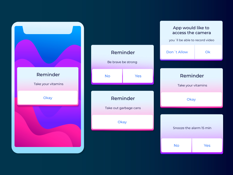
I think everybody here has heard of hashtags or even used them at least once in their life. Well, tags are something similar and have the purpose of making our lives less stressful and our work sorted out. To put it more swiftly, tags are interactive elements that allow the user to navigate more easily and help them find the terms, elements, or content that they have linked the tag with.
So, tags are links between data that give the user the ability to find and organize specific information and elements as they please. It’s like adding a filter to your design, making it straightforward. Tags can make selections, give the user the opportunity to filter the information, and set off actions.
Tags VS Category Names
You might wonder why create tags when you can simply use category names. Well, category names are premade and don’t give you the ability to custom and modify them as you please. On the other hand, we have tags, which are usually crafted by the users themselves, so are more precise and accurate than any category name can be. And not only that the user can create tags, but also anyone with access to the UI/UX design. So your productivity and your colleagues' productivity levels will increase.
Principles of Using Tags in UI Design
In order for your tags to be reliable, you need to follow three simple principles.
- Compact. Tags need to be compact elements that speak for specific information. It’s no surprise that when you are looking for something, you want to find it as quickly as possible. So, you need to create a tag that can help you do that by making it as precise and distinct as possible.
- Focused. The purpose of tags is to simplify and make your work easier, so the content should be easier to find. So, try and create tags that help the user complete an assignment as fast as it can get.
- Reliable. Tags should be the direct link between the content that they stand for and the content that the user is looking for. Make sure that your tags are relevant so your users can find what they need. Use information that represents exactly what the tags stand for.
40% OFF
Only this February
Upgrade to UI PRO version of Uinkits Systems to unlock 23.000 UI components.
Use the code "FEB40"
Types Of Tags
In order to sort the best information, tags come in a variety of types. These help your users enjoy a better experience and have a more intuitive encounter with the content available in your UI/UX design. So, making sure you keep in mind those types will help you design better.
Input tags
The role of this tag is to represent the information used in a certain field. An input tag should allow the users to fill the space with the data they are looking for. So, an input tag helps the user be more precise and productive in their search. They give the user the opportunity to transform the text into tags.
When it comes to the way input tags act, they can have transformative, editable informational, multiple, movable, and expandable behaviors.
- Transformative behavior. This means that the text can be transformed into a tag.
- Editable behavior. Input tags give the user the ability to edit the text until the action is made.
- Informational behavior. Input tags have the ability to display a message if the text entered is not recognized or misspelled.
- Multiple behaviors. This behavior allows a single field to obtain multiple input chips.
- Movable behavior. Meaning that we can change their order and move them after our preferences.
- Expandable behavior. This behavior gives input tags the ability to showcase more information with the help of transform transitions.
When it comes to their placement, input tags give the user the liberty to be placed inline, in a stacked list, and horizontally.
Filter Tags
This tag gives the user the opportunity to choose from a selection that is already created. A filter tag is an easy way to sort out the information and select one or more tags to represent your search. You can easily find this type of tag when looking for clothes and the filter tag gives you the ability to choose a size, color brand, or fit at the same time. So, they represent the filter you require for a collection. Those tags use descriptive words to fill in the tags, being another option for toggle buttons or checkboxes.
When it comes to their behavior, filter tags are very easy and deductible to use. They can be selected or unselected with a simple click and allow the user to select multiple variants.
For their placement, filter tags are usually found underneath the search bar, for easy access and selection, improving the user experience. They can also be found on the side sheet, placed horizontally by category.
Choice Tags
These tags can be found in sets that have at least two options, and choice chips represent a single selection. Choice tags are a good alternative for radio buttons, toggle buttons, and any single selection menu. When it comes to their behavior, choice tags simply deselect when you press on another tag, leaving a single option available for the user.
When placing them, tags can be found horizontally and sequentially. However, you need to pay attention if you choose to display them on different rows, as it can cause confusion and a worse user experience.
Action tags
Those tags have a similar usage as buttons, as they can trigger certain actions by being pressed, sending the user to another page, or opening up a widget. However, as opposed to buttons, action tags are more compact, and that gives you the ability to be placed in a row.
When it comes to their behavior, action tags have the ability to set off another action and show progress or even confirmation or feedback.
Their placement needs to follow the prime content so they can be found below a card or at the bottom of the screen. However, you need to pay attention when displaying them, as sanction tags need to be placed in a set.
Uinkits – Our Figma Design System and UI Kits
We at uinkits understand the importance of great user experiences and creating amazing UI designs. That’s why we’ve developed a Figma UI Kit with design components that include these essential UI elements that enable you to design intuitive and user-friendly interfaces effortlessly.
“You press the button, we do the rest,” – Kodak.
Inspired by this iconic tagline from Kodak, we believe in simplifying the design process for you. Our Figma UI Kit, uinkits, is a complete design system with UI components that allows you, as a UI UX designer, to create your products as quickly as pressing a button.
Our design system includes components, icons, variables, cards, buttons, and everything you need for your design process. All you have to do is take your UI design component needed, and you’re ready to use it in your designs!


