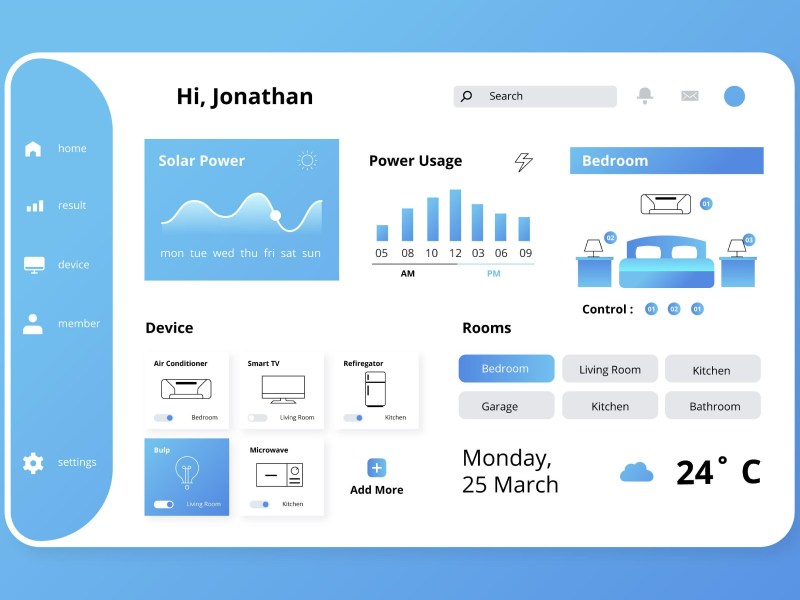
Colors have the power to transform a design. They carry the means to influence our audience and completely change how we see a design. Think about Netflix’s deep red web and app design. When opening the app or web design, we are instantly carried into a cinema theatre where the deep red color palette mimics the real appearance of a cinema. This is not the only UI UX design that uses color to immerse the users into the design.
A neutral color palette can take your design to a more minimalistic and completely different visual identity than a bold color palette could create. Neutral colors such as white, gray, shades of brown, or tans are usually the main chargers in a design. However, you can try a Natural Color Palette and see how your design can be simple yet still modern.
A natural color palette includes black, white, and shades of brown or gray. It offers an elegant look and creates an environment where the design is clean and easy to navigate and scroll through. Neutral colors are usually used for text or background, giving the app or web design a clean appearance. So, what shades form a neutral color scheme can we integrate into our web or app design?
- Black – Ever since dark mode emerged, the color black has been used more and more in UI UX design. The color has a powerful appearance and gives the design a sophisticated look. When thinking of black color psychology we need to mention its association with death, evil, or mystery, yet, black seems to be the color that is indispensable in a natural color palette. The color black is usually used for typography reasons, yet it can be encountered in larger forms in some designs.
- White – Now, going to the opposite side of the nature color palette, we have white. As the color black, white is almost indispensable in a design. We use the color white to create space and offer a clean look of the web or app design. White can be combined with every color from the color wheel, providing a flawless design look. In color psychology, the color white carries the meaning of purity, which is associated with infinity, and creates a simple and minimalistic look.
- Gray – Grey is another color that is attributed to the neutral color scheme. The color gray can be used as a replacement for white and is used as a lighter form of black. It is considered to be a more modern replacement for black and can always be integrated into your app or web design. Gray gives the impression of professionalism and it is a great alternative to more darker shades and offers the best color combinations.
- Brown – Brown is an earth color that brings us closer to natural shades. It is the color of wood and gives a natural and warm look of the design. It can be easily found on the natural color palette and you can integrate it into your UI UX design to evoke a connection to nature. The color brown is usually encountered as a background color and it creates a feeling of warmth and calmness.
- Beige – Beige is the chameleon of the neutral color palette. It can either adopt a worm or cold tones depending on the colors that they are associated with. Likewise brown, the beige color has the power to offer a worm look of the app and web design and it is usually encountered as a background color. It can be integrated easily into the design and it is a subtle way in which you can create a flawless and wholesome design.
A neutral color palette is a must-have in any web or app design. Choose your neutral color palette based on your needs, and don’t forget that colors are a language themselves. Each color carries its message. So, use them to cover your needs and evoke the meaning you want them to have.
We at uinkits understand the importance of inputs in great user experiences and creating amazing UI designs. That’s why we’ve developed a Figma UI Kit with design components that include these essential UI elements that enable you to design intuitive and user-friendly interfaces effortlessly.
“You press the button, we do the rest,” – Kodak.
Inspired by this iconic tagline from Kodak, we believe in simplifying the design process for you. Our Figma UI Kit, uinkits, is a complete design system with UI components that allows you, as a UI UX designer, to create your products as quickly as pressing a button.
Our design system includes components, icons, variables, cards, buttons, and everything you need for your design process. All you have to do is take your UI design component needed, and you’re ready to use it in your designs!


