Gauges (or activity gauges) are UI design elements that show progress when completing a goal. They serve as data visualization and indicators for users to finish their desired actions.
Staying organized can be easier than ever when we use UI design gauges. Gauges can offer accurate meter readings. In UI/UX design, gauges can also be used to measure data which can be helpful for anyone who needs an overview of the activity. Gauges can let the user know when something is happening by warning them.
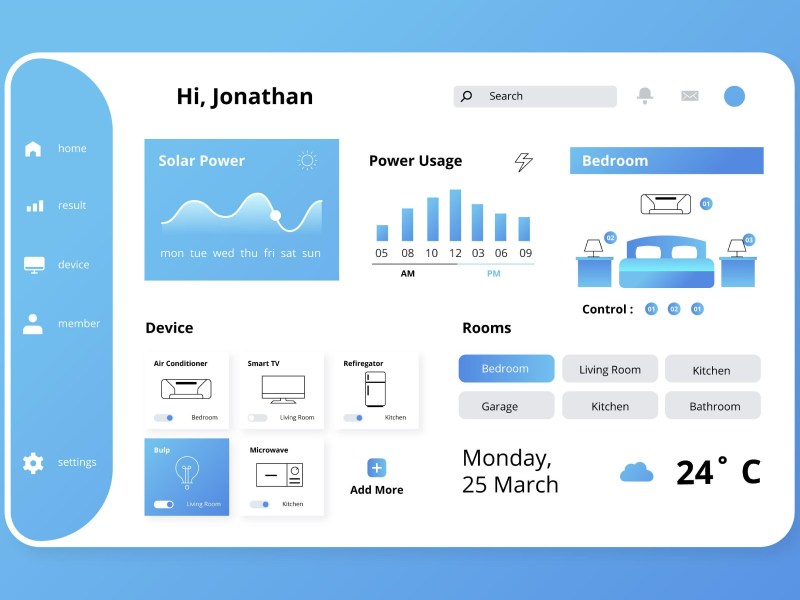
Gauges are common elements used in dashboards – both in website design and software and mobile application design. In UI design, gauges are differentiated from other progress elements through the presence of an arc. They visually indicate a particular value within a defined range. These values are shown either through a needle or through numerical values or percentages, along with specific colors relevant to the gauge or the range.
In UI/UX design gauges have different types in order to fit any requirements and keep the consistency of the design and to create a great user experience. Gauges need to be easy to read, and deductible for the users.
1. Speedometer
This is the most popular type of activity gauge, and it is used in dashboards to display performance metrics.
It resembles a vehicle’s dashboard, and it consists of a circular arc with a needle pointing to the value. Because of its circular shape, it is also used to compare different ranges of values. Depending on the value range, the color will switch.
2. Linear Gauge
The difference between linear and speedometer gauges is that the data is presented horizontally or vertically. They indicate the numerical values within a defined data range on a linear scale. With linear gauges, the specific value is indicated through a pointer on the scale.
3. Angular Gauge Chart
Angular gauges are similar to speedometer gauges but display only a part of the arc. The displayed area represents the value of the progress chart and is usually filled with color, leaving the rest of the range unfilled.
Activity gauges are popular in business dashboards and are used to display deeper insights into a business.
- It is useful when a dashboard has specific KPIs based on a specific target. This way, it visually shows where the user is and how long it takes until a target is reached.
- It is useful when a dashboard presents the progress of the tasks.
- It is useful to keep up with deadlines.
- It is useful when a dashboard is used to observe changes and monitor metrics over a period of time.
Graphs should be helpful and counterintuitive. Make sure that your users understand what you are sharing and that the comparisons are on point. Use colors to differentiate between categories. You can also use color to highlight and bring attention to certain areas of your text. In gauges, color can also represent quantities.
Think, for example, of a situation where you want to emphasize the number of certain populations with the largest stray cats. Usually, the darker colors indicate a higher number of stray cats from that certain country. However, as you are coming closer to lighter colors, this means that the number of stray cats encountered in those countries is decreasing. So, color can help the user and trigger a better user experience as it can turn your design on the more deductible side.
Depending on your needs, divide the gauge into segments to represent different data ranges. Use contrasting colors, patterns, or shading to differentiate these ranges. The recommended ranges for the speedometer or linear gauge are between one and four. More than four will overwhelm the user and visually clutter the design – especially if you have completely different colors.
The needle or indicator of a gauge activity will automatically move when the value changes. The animation feature allows users to see their progress actively. If you opt not to have a needle or indicator, make sure you still write the numerical value or percentage instead.
Visually, a gauge can be of two ways: thick or thin. In UI/UX design the series thickness of a gouge can be adapted to fit the rest of the design.
Creating gauges can become easier than ever with the help of a design system. With a design system, we automatically eliminate this dead time. Creating a component takes time – not only for designing but also for research and feedback. However, clearer guidelines mean less research and fewer rounds of feedback, which means fewer revisions. With a design system, it also means fewer risks of error.
We at uinkits understand the importance of inputs in great user experiences and creating amazing UI designs. That’s why we’ve developed a Figma UI Kit with design components that include these essential UI elements that enable you to design intuitive and user-friendly interfaces effortlessly.
“You press the button, we do the rest,” – Kodak.
Inspired by this iconic tagline from Kodak, we believe in simplifying the design process for you. Our Figma UI Kit, uinkits, is a complete design system with UI components that allows you, as a UI UX designer, to create your products as quickly as pressing a button.
Our design system includes components, icons, variables, cards, buttons, and everything you need for your design process. All you have to do is take your UI design component needed, and you’re ready to use it in your designs!


