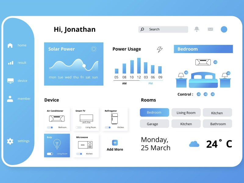
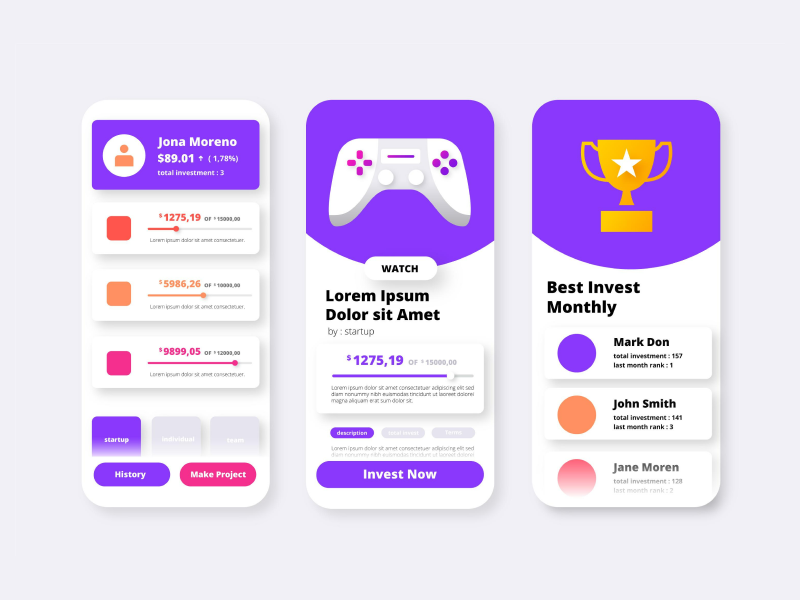
The UI UX design world is booming! So, it’s no surprise that we’re seeing a growing number of people becoming UI UX designers. And guess what? Each of them has an impressive UX design portfolio!
It makes sense! The continuous advancements of technology have created the perfect environment for UI UX designers to prosper. And such roles are currently in high demand as more digital products are emerging every day. After all, businesses need a website design or an app design for their product.
But since the UI UX design industry has become so competitive, how can you stand out from the others? Everyone might be just as skilled and creative as you are – sometimes maybe even more. So, how can we show our true potential to employers or clients? Exactly – by having an even better UX portfolio.
Don’t worry! Whether you’re a UI UX designer at the beginning of your career or already experienced, we’re here to give you all the tips and tricks on how to create the UX design portfolio that will land you your next project!
What Is a UX Design Portfolio?
A portfolio is the designer’s equivalent of a resume. This is the most important form of branding a designer constructs in order to get hired. But a portfolio is much more than just an extensive list of previous projects and collaborations.
In comparison to a basic CV, we can integrate a lot more visual elements into a portfolio through which we can create an immersive experience for the reader. It is also easier to feature your personality in a portfolio because it allows for much more creativity to shine through. Its main goal is to showcase the journey you have made, to reflect progress rather than just the conclusion and result. By looking over it, the employer should be able to figure out who you are, what you want to do, and how you can tackle a UI/UX issue.
You never get a second chance to make a first impression. This is why we must make sure that our portfolio stands out and makes an impact.
Only this December
Upgrade to UI PRO version of Uinkits Systems to unlock 23.000 UI components.
Use the code "DEC40"
Importance of UX Design Portfolios
UX Portfolios are the first contact we have with employers. And this will determine their first impression of us. So, a strong UI UX design portfolio should be able to tick the following boxes:
- Clearly communicate what our strengths are
- Set us apart from the competition
- Document the impact of our UI UX designs
- Showcase our personality and interests
While a basic resume only briefly taps into your experience, UX designer portfolios can encompass a wide array of skills and projects that are presented in an interesting and personalized manner. Let’s take a look at some helpful tips on how to create a successful portfolio.
How To Create A UX Design Portfolio
UX Portfolios are one of the most efficient tools through which we advertise ourselves as UI/UX designers. So, let's see the beneficial steps to create the best UX portfolio.
- Storytelling
Case studies are instrumental in getting to know what a designer has worked on. To maximize their impact, we could follow the great practice of storytelling. Because every project we work on has a history, we should showcase the steps and stages it has been through.
Great design is storytelling at its finest. Stories are engaging. Rather than just briefly listing the designs we have created, it is more immersive and interesting to introduce them in the form of a story. Especially in the case of designers who do not have extensive experience, following this type of layout can really improve a UX designer's portfolio. If we do not have a wide array of projects to choose from, creating interesting layouts, copies, and visuals for the ones that we have can really help sell them.
- Simplicity And Clarity
We often see the phrase less is more appear in the world of design. This is because a design that cannot be easily understood and navigated loses its purpose and value. One of the things we should always keep in mind during the portfolio creation is to only include relevant information.
This does not only narrow down to the presentation of the case studies. It is a principle that we should apply to every section of the portfolio, from the landing page to the About and Contact sections. The language we use when describing our work will influence the perception of our projects. Our focus should be the easiest and most intuitive way of conveying our message. If we use jargon and overtly technical explanations we might make our UX portfolio inaccessible and unattractive.
Generally speaking, it is better to avoid making a UX design portfolio cluttered, complicated, and inconsistent. Always ask yourself the question “Is this information relevant to what I want to convey?”
- Diversity And Quality
The selection phase during the creation of a portfolio can be quite frustrating - especially when you have many projects behind. However, the two most important factors to consider when choosing between designs are diversity and quality. Experts usually advise that a portfolio contains between two and five case studies.
Now, the designs we select must be both relevant to the job we are seeking and the type of experience we want to highlight. For example, if we are looking for a job in mobile apps UI/UX design, there would be no reason to focus our UX portfolio on website designs. Our portfolio must reflect who we are and what our goal is.
The biggest probability is that whoever will review our UX design portfolio has already seen countless before. To avoid boring the recruiter, we should choose quality over quantity. Not only does it bring our skills to the forefront, but it shows the viewer that we know how to market ourselves. In case you do not have a lot of experience in your target field, a good alternative is taking up a few side projects to integrate into your collection.
- Progress
One of the main things any employer looks for is to see our problem-solving skills. Let’s say that we have a great design we worked on and we wish to include it in our UX design portfolio. It is not enough to display the final product, no matter how impressive it may be. We also need to present the steps and stages it has been through.
From the research methods to the user journeys and prototyping, all the way to the conclusions you have reached, all of these should be chronologically displayed in a portfolio. This approach also provides us with the chance to showcase the way our design thinking works
- Target Audience
As we have already acknowledged, it is crucial to have clear goals in mind when designing a portfolio. If we are looking for a job in UI/UX design for virtual games, our portfolio needs to answer the requirements of the industry.
Some employers will not bother to go over every case study in a UX portfolio. That means that we must make sure that each one of them communicates our goals and reflects the skills that are suitable for a certain area of UI/UX design. We can always revise our UX designer portfolios and adapt them depending on what type of job opportunity we are seeking.
- Updating
Because we work in the digital industry, one of our biggest challenges is to keep up with all the updates that appear. And, oh, do they keep on coming!
Compared to a basic resume that you would probably only update whenever you switch positions or companies, portfolios require constant attention. With every new project we take up, we gain new skills and knowledge. We should apply these new abilities to older projects and refine them from time to time. A portfolio should reflect personal progress and evolve alongside ourselves. This is why it is a good idea to treat them as work in progress.
- Feedback
Two heads are better than one. It can always be helpful to get a second opinion from someone who is also a UI UX designer or works in the field. If you do not have many acquaintances who are familiar with digital design, there are many online communities where you can discuss similar interests.
Another aspect of feedback is to gather it from users. The designs you craft are destined to be utilized by website and app users. If you have already worked on projects that have been released, it is crucial to follow their public reception. Was the design successful? What did the users like about it? What could be improved?
- Promotion
You could have a perfectly crafted portfolio but have no employers contacting you about it. Why? Because you were not able to properly advertise it.
There are many promotion options available for free. For example, websites like Behance and Dribble offer the perfect habitat to display UI/UX portfolios. Here you can also gain inspiration from what other designers are posting, as well as getting feedback from them. Social media is another effective way of promoting your designs. While LinkedIn and networking platforms alike are usually the places where potential employers look for designers, Instagram, and other creativity-oriented hubs can attract the attention of many people from the industry.
- What To Avoid
Now that we have gone over tips on making a portfolio as outstanding as possible, we should also take a look at some practices that might decrease the quality of it. Especially for a designer with little to no experience, it might be tempting to include any type of design project they have done in their portfolio. Unfortunately, the inclusion of low-effort, rookie type of projects will not only make someone look less professional, but it also serves no real purpose in the eye of the employer.
Another aspect that should be scratched off is the addition of any projects that turned out to be unsuccessful. This includes designs that you were not passionate enough about to finish. Maybe you were collaborating with a client who was not a good fit for you. Whatever the reason may be, skip the projects that do not reflect your work in a positive light.
Remember that a good portfolio will reflect who you are, how you got where you are now, what are your greatest strengths and what your goals are.
uinkits – Our Figma UI Kit
We at uinkits understand the importance of inputs in great user experiences and creating amazing UI designs. That’s why we’ve developed a Figma UI Kit with design components that include these essential UI elements that enable you to design intuitive and user-friendly interfaces effortlessly.
“You press the button, we do the rest,” – Kodak.
Inspired by this iconic tagline from Kodak, we believe in simplifying the design process for you. Our Figma UI Kit, uinkits, is a complete design system with UI components that allows you, as a UI UX designer, to create your products as quickly as pressing a button.
Our design system components, including variables, cards, buttons, and everything you need for your design process. All you have to do is take your UI design component needed, and you’re ready to use it in your designs.


