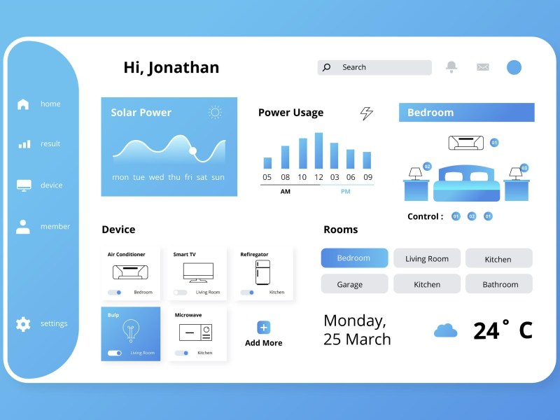
A UI/UX design keyboard gives the opportunity for users to navigate an app or a website more easily. A keyboard is a combination of elements that can create shortcuts and create a better user experience.
The UI/UX design keyboard helps create faster navigation of the site or app and can even include shortcuts. The use of keyboards is not required all the time, in some cases the use of radio buttons, toggle switches, or chips can trigger better responses and a better user experience.
Think like your users and see which one is the easiest solution that can be implemented in your design, and if the answer is a keyboard let’s see what type of keyboard you should use in your design.
In the UI/UX design world, there are more types of keyboards than the alpha and the numeric ones. Each keyboard is used for different needs and has different key mappings. We all know the qwerty layout, but there are more options available, such as Dvorak, Colemak, Workman, or Neo.
Those layouts even though are different they carry the same purpose – deliver a great user experience by reducing finger movement. This is where shortcuts come into play to help our users make different actions as fast as they can while only using a few commands.
General Shortcuts For Keyboards
- Show shortcuts cheatsheet: Shift + /
- Screenshot: Shift + Command + S (Mac) or Shift + Control + S (Windows)
- Delete/Exit: Esc
- Change font size: Command Shift P(Mac) or Ctrl Shift P (Windows)
- Edit element: Enter
- Copy: Command + C (Mac) or Control + C (Windows)
- Cut: Command + X (Mac) or Control + X (Windows)
- Paste: Command + V (Mac) or Control +V (Windows)
- Duplicate: Command + D (Mac) or Control + D (Windows)
- Undo: Command + Z (Mac) or Control + Z (Windows)
- Redo: Shift + Command + Z (Mac) or Shift + Control + Z (Windows)
As UI/UX designers we need to make sure that our user's needs are fulfilled. We need to keep in mind that some users are more used to using a keyboard than others. So, finding the right balance of keyboard usage is mandatory for a great user experience. And a good practice is to try to navigate the design only using the keyboard and observe the accessibility levels our project offers for predominant keyboard users.
- The main issue that can happen when using a keyboard is not having a visible focus state. We can all agree that navigating a webpage can get difficult if we don’t see the elements we come across. So, as UI/UX designers we need to implement visible states when the keyboard is the main tool used.
- Use keyboards that match the content the users are editing.
- Adapt the design with the size of the keyword by making the design scalable. Make sure that the keyboard layout and the app interfaces look aesthetically pleasing together.
- Ensure that all interactive elements can be triggered with the help of the keyboard.
- Let the users know when they selected an element with the help of the keyboard with a focus state.
- Ensure that the user has the possibility to “skip to content” and move to the next steps or forward with the help of the keyboard.
- Make sure native elements are used.
When using the keyboard we need to keep in mind that the tab order doesn’t need to be changed. If your users navigate with the help of the keyboard when a modal is opened, the tab order needs to remain the same in order for a good user experience to be established.
- The keyboard should be helpful in any situation that includes entering or editing text, data, or forms. The keyboard should help the user step to the next category, fill in, or even exist it.
- When entering a shortcut, or editing interactive components such as opening links when taping buttons.
- When selecting inputs from a dropdown.
Creating a keyboard can become easier than ever with the help of a design system. With a design system, we automatically eliminate this dead time. Creating a component takes time – not only for designing but also for research and feedback. However, clearer guidelines mean less research and fewer rounds of feedback, which means fewer revisions. With a design system, it also means fewer risks of error.
We at uinkits understand the importance of great user experiences and creating amazing UI designs. That’s why we’ve developed a Figma UI Kit with design components that include these essential UI elements that enable you to design intuitive and user-friendly interfaces effortlessly.
“You press the button, we do the rest.” – Kodak.
Inspired by this iconic tagline from Kodak, we believe in simplifying the design process for you. Our Figma UI Kit, uinkits, is a complete design system with UI components that allows you, as a UI UX designer, to create your products as quickly as pressing a button.
Our design system includes UI components, icons, variables, cards, buttons and everything you need for your design process. All you have to do is take your UI design component needed, and you’re ready to use it in your designs!


