

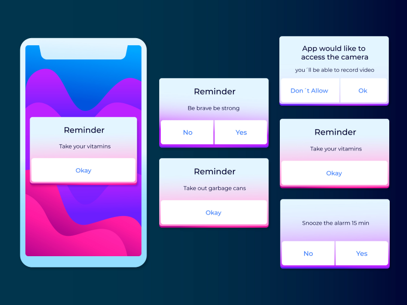
Dropdown menus are present everywhere. After all, they are one of the most common UI components that really help increase the user experience for our visitors. So, if you are wondering what dropdowns are and how you can use them properly, you came to the right place, as we will shed some light on your questions and be the guide you need.
What Are Dropdown Menus?
Well, dropdowns are one of the most used manners available to a UI/UX designer to provide a plethora of variants to a user without taking them to a new site. It is a convenient and faster option that saves time from designing another page.
However, we also need to mention that there are two main types of dropdowns, namely – those used for navigation and the ones we can find in forms. Dropdowns can come with a lot of features that will help you be more precise, like organizing options and keyboard navigation. And when it comes to the visual aspect, dropdowns are similar to text input fields.
Types of Dropdown Menus
When it comes to the types of dropdowns available, we can all agree that common or standard dropdowns are the most encountered ones. However, choosing the right dropdown can define your UI/UX design and bring the user experience to a whole different level.
1. Standard Dropdown Menus
Well, this type of dropdown is the one that comes up in everyone’s mind when thinking about a dropdown. A dropdown needs to have the text hidden, and the dropdown menu should pop up only when an action has taken place.
2. Dropdown Menu with Autosuggest
Those dropdowns can sometimes be a lifesaver. They are usually encountered in your search bar and can save you a lot of time. The whole purpose of the dropdown with autosuggest is to offer you more variants, and it can prove to be very helpful when the users already know what they want to fill in. Autosuggest offers you variants for your input field based on the letters or terms you have typed so far. Think about when you are completing a survey, and you need to fill up the country you are from. When you type the first letters, that autosuggest comes in handy.
3. Dropdown Menu with Autocomplete
This variant should not be distinct from the autosuggest, as the autocomplete offers you the option to choose from. The auto-complete process happens inside the UI text field, as the software predicts your available alternatives by using its internal dictionary. It analyses what you intend to type depending on the first letters and the suitable options, filling in the most fitting variant available from the dropdown. So, with autocomplete, your user can focus more easily.
4. Dropdown Menu with Multi-select
This dropdown option is created with the help of checkboxes, an extension of checkboxes where the user has the ability to select multiple variants. However, this type of dropdown can quickly get overwhelming as you will be required to fill all the boxes you are interested in.
5. Dropdown Menu with Groups
These types of dropdowns are still not the ideal ones to use when you have to complete a large selection of items. Even so, dropdowns with groups give you the ability to be more organized as they can be found under different categories.
6. Date Picker
This type of dropdown will only be efficient when you want to see exactly the day of the week. And let’s be honest here: this is only helpful when you are scheduling an appointment, a date, or an event. On the flip side, when I’m entering my birthday or when I am trying to fill in my card details, a dropdown can get really annoying. However, if none of the dropdown types mentioned above seem the right choice, a multiple-select menu can be a good alternative. Compared to a dropdown, a multiple-select menu is open from the start, and you will see the option available at the distance of a scroll.
40% OFF
Only this February
Upgrade to UI PRO version of Uinkits Systems to unlock 23.000 UI components.
Use the code "FEB40"
Dropdown Menu States
As you might expect, dropdowns need a certain interaction in order for the element to switch its appearance and interact with the user. So, let’s see which dropdown states we should encounter when an action is set off.
- Active state. This is the primary state where the dropdown has yet to be interacted with.
- Disabled. This state of a dropdown will be noticeable, but the user will not be able to interact with it.
- Hover. This state should show the user that the possibility of an interaction with the dropdown is available.
- Highlight state. This state should appear when the user is trying to interact with the dropdown.
- Focus state. This state happens when the user interacts with the dropdown by clicking on it and deciding to make a certain action. Even more so, the option that represents the user's choice can also be highlighted.
- Completed input. This state should only take place after the user has completed an action so the dropdown can come to its initial state.
- Feedback fail. This state can only appear if one of the users made a mistake or a typo. We can all agree on the fact that at least once, we did something wrong.
Dropdown Menu Styles
- Dropdown styles. Refer to the aesthetic part of the design. It focuses on how the users see the designs.
- Attached style. This is one of the common styles that can be encountered. It is when the whole dropdown can be seen as a whole.
- Detached style. This is the opposite of the one from the above. The dropdown will have the menu detached from the selection available. At the same time, it can switch sides depending on the user’s viewport.
- Rounded borders. This one is as intuitive as it sounds. The dropdown design has rounded borders.
- Material design’s filled dropdowns. This type of dropdown depends only on your personal preferences, as both filled and the outlined dropdowns look great. The filled dropdown has an item already filled by default.
- Material design’s outlined dropdowns. This dropdown type can be differentiated from the filled one, as the users can fill in the gaps with their chosen option.
- With images. Even though adding images to your dropdown can seem like a lot of work, it is worth it, depending on the size of your dropdown. The images can be too small and hard to observe, causing a bad user experience.
- With icons. The dropdown can include an icon at the beginning of the text, making it look more playful.
uinkits – Our Figma Design System and UI Kits
We at uinkits understand the importance of great user experiences and creating amazing UI designs. That’s why we’ve developed a Figma UI Kit with design components that include these essential UI elements that enable you to design intuitive and user-friendly interfaces effortlessly.
“You press the button, we do the rest.” – Kodak.
Inspired by this iconic tagline from Kodak, we believe in simplifying the design process for you. Our Figma UI Kit, uinkits, is a complete design system with UI components that allows you, as a UI UX designer, to create your products as quickly as pressing a button.
Our design system includes UI components, icons, variables, cards, buttons and everything you need for your design process. All you have to do is take your UI design component needed, and you’re ready to use it in your designs!


