An accordion is a UI element that consists of a vertically stacked list of components that can be expanded or collapsed. This way, when triggered by an interaction these elements will allow our users to see or hide the associated content as desired. In other words, it’s the little box of text or images that appears when we click on a certain element or hover it with our mouse. And usually, accordions have a small arrow downwards or a “+” as visual cues.
Yes, it’s also a musical instrument, but that’s not what we’re talking about right now. However, we could make an interesting parallel between the two. Both accordions – the musical instrument and the UI design element – share a common thread of controlled expansion and compression, whether it's for navigating information or creating beautiful harmonies.
A great example of an accordion is the navigation menu on a website. Given the limited space, it would be impractical (and quite impossible) to include all the categories and subcategories that we want to show in the navigation bar. So, the accordion design allows them to access subcategories or additional information as needed, without cluttering the design.
As UI/UX designers, we want the same things: for our designs to be aesthetically pleasing and intuitive in functionality. And accordions align perfectly with these objectives.
How exactly? Well, think of a website that requires a lot of information – which is pretty much almost every website on the internet. But with accordions, we can break down complex content into manageable sections by using progressive disclosure. This way, not only can we decrease cognitive load, allowing our users to focus on one piece of information at a time – and automatically improve the user experience. But we can also avoid visual noise by presenting the information in a clean and organized manner. Think about it! Instead of having all the information on a page, our user can simply trigger the UI accordion to reveal that information.
Because of this, we can use this for multiple purposes – including navigational purposes. This way, we can create link groups that can help our users move from one page to another or from one feature to another. Because of this, accordions are proven to be especially valuable in mobile design. Why exactly? Well, since on mobile screens, there is limited space, accordions allow us to collapse our content into multiple sections.
Okay, we’ve established what accordions are and why we should implement them. But what exactly are the types of accordions?
- Single Accordion – This is the most basic type of accordion in design as it consists of a single panel that can be expanded or collapsed. This is usually used for additional information under the form of “Learn More”.
- Stacked Accordion – A collection of multiple single accordions stacked together. However, each accordion works individually, and our users can choose which accordion to open. In other words, if you want to see a certain option, they won’t reveal all accordions, just the ones selected.
- Hierarchical Accordion – Stacked accordions with other sublayers. This way, users can expand or collapse not only the main panels but also the sub-panels. It's effective for displaying structured information with multiple levels, such as categories and subcategories.
- Fields Accordion – The Fields accordion is used in forms or data entry interfaces, such as booking forms. This way, it helps our users to focus on filling in specific sections of the form while keeping the others hidden.
- Accordion Menu – This is often found in website navigation. It displays a list of categories or menu items, and when clicked or tapped, the menu item expands to reveal sub-items or related content.
Yes, accordions can be used for different purposes and in different ways. But the elements of accordions remain the same all the time: headers, icons, and panels.
1. Headers
Accordion headers serve as the clickable titles or labels that users interact with to expand or collapse accordion sections. These titles are short phrases that describe the content within the corresponding section, providing the user with an idea of what they will find out when clicking on it.
Martin LeBlanc said something that should be applied in every design: “A user interface is like a joke. If you have to explain it, it’s not that good.”. And he’s right! Make sure that your accordion headers are concise and self-explanatory. Avoid vague labels that may confuse users or require additional context to understand because otherwise, your accordions will be just a joke that no one will want to hear twice.
2. Icons
The icon plays a pivotal role in indicating the expandable nature of accordion sections. It serves as a visual cue that prompts our users to click on the header to reveal or hide the associated content. These are usually to the right or the left of the headers and are oriented in a way that aligns with the direction of expansion.
When creating an accordion, we can use the following icon sets:
- Chevron icon
- Up/Down arrow
- Up/Down caret
- Plus/Minus
In design, Wwhen the accordion is collapsed, the icon usually points downwards, indicating that there's hidden content that can be expanded. Once clicked, the accordion expands, revealing the content, and the icon usually rotates to point upwards. This intuitive visual feedback helps our users understand the interaction and understand what they have to do.
3. Panels
Panels are the UI design elements that refer to the content areas within an accordion that expand and collapse when interacting with the headers. In other words, these hold the hidden information or content that is revealed when we click on the corresponding accordion header.
Panels can contain various types of content – such as text, images, forms, or even embedded multimedia elements. It can even be composed of bullet points or even paragraphs – it all depends on the specific use case and design requirements. Usually, the content within the panels provides additional information or options related to the header, helping our users access relevant details without overwhelming the interface.
States of an Accordion:
The default states of an accordion in design are:
- 🔽 Collapsed
- 🔼 Expanded
- 🖱️ Onhovered
- 🔍 Focused
- 🚫 Disabled
Yes, accordions have become a common UI design element when creating a new platform. However, users are still struggling to identify due to the variety of styles and implementations that they have come across. So, here are some tips on how to design accordions:
- Ask Yourself – “Do I Really Need an Accordion in My UI Design?”
- Use a Concise and Descriptive Header!
- Use a Visually Distinctive Icon
- Use Visual Cues
- Be Consistent!
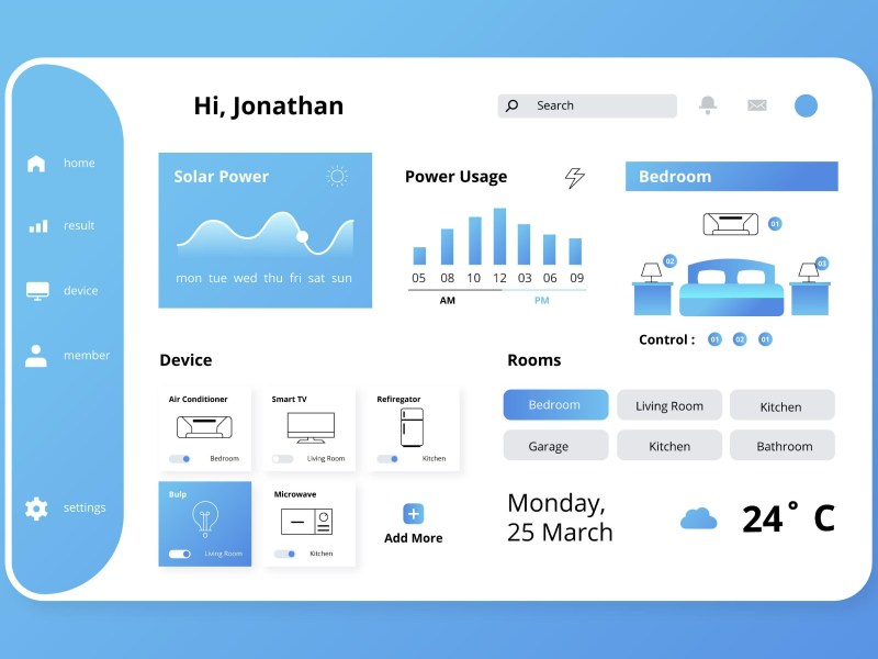
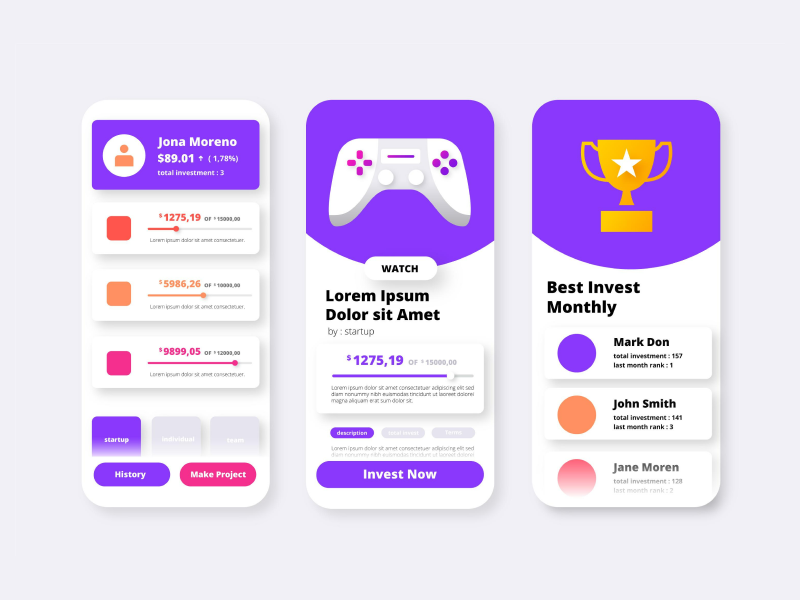
We at uinkits understand the importance of inputs in great user experiences and creating amazing UI designs. That’s why we’ve developed a Figma UI Kit with design components that include these essential UI elements that enable you to design intuitive and user-friendly interfaces effortlessly.
“You press the button, we do the rest,” – Kodak.
Inspired by this iconic tagline from Kodak, we believe in simplifying the design process for you. Our Figma UI Kit, uinkits, is a complete design system with UI components that allows you, as a UI UX designer, to create your products as quickly as pressing a button.
Our design system includes components, icons, variables, cards, buttons, and everything you need for your design process. All you have to do is take your UI design component needed, and you’re ready to use it in your designs!


