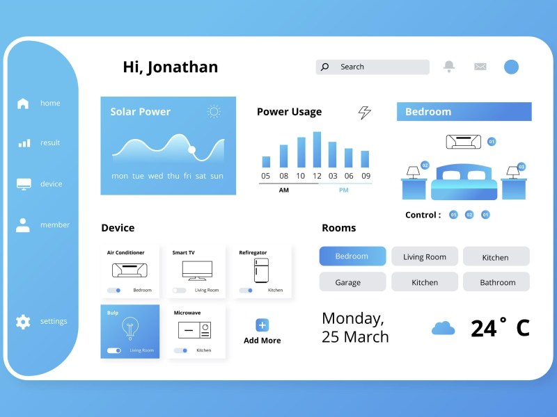
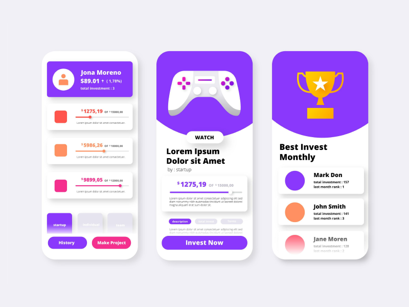
Links help us create connections. They give us the ability to interact with other elements and sites being how we can jump from one page to another. Links are the roots that help us access different websites. They allow the user to receive additional information or find more in-depth information on the subject they were researching.
However, too much information sometimes can get overwhelming, which leads to a bad user experience. Scott Belsky believes in the “Rule of thumb for UX: More options, more problems.”, encouraging UI UX designers to create UI UX designs that are straightforward, readable, and easy to understand. And this is also applied when using links inside UI elements like cards.
Find your balance, and try and stay away from unnecessary information and links. Albert Einstein taught that anyone can build something complex, but only a handful of people can make something simple. So, don’t duplicate links when is not necessary, nobody likes UI cards that are full of blue underlines. However, if you are using links, make sure that they are visible. A link that has the same size, font, color, and style as the rest of the text will simply be ignored.
When it comes to UI UX design we need to be careful with any small element we create, as they can be the ones that turn our design around.
- Use content that matters
When including links in your designs or in your elements you need to be precise and make it obvious. Don’t use phrases that can keep you further away from the topic. Using generic links creates risk, it doesn’t let the user know what to expect and it puts them in a situation that triggers uneasiness.
How many times have you clicked on something that you believed was redirecting you to another site, but instead it downloaded a hefty research paper that you simply didn’t want? So, instead, add additional information, explain what you are linking, and make sure that your user feels comfortable when clicking your hyperlinks. Transparency is the one that can create a good user experience and can also lead to faster usage.
- Make Your UI/UX Design For Everyone
Visually impaired users or those who prefer the “screen red” of a page will appreciate a text that has the links all in one place. When we want to ignore a link we normally don’t interact with it. But, for “screen readers” this option is not available.
When you choose to integrate numerous links into your design you will obtain a butchered text that will sound like “the country – link – has announced – link – that it will – link”. So, in the next few seconds, they will probably exit the site and leave your UI/UX design to the past, as anyone would do in this situation. This is why it's always important to develop an accessible UI/UX design completely.
- Customize Your Links
A web link needs to be made out of characters that can be read. And if you don’t know what I am talking about, I think we all saw links made out of combinations of letters and numbers that don’t make any sense. Well, your users will be as confused as you when reading that, so use readable links and customize them when needed.
Change the unreadable parts that look like this @#12\5 and make them look like this www.yoursite.com, and your users will be more prone to click on them. However, don’t cut out the meaningful parts, customize the link and make them as simple as possible.
- Be Precise
Some links can be more important than others, so make them pop out by transforming them into buttons. When you are encouraging your audience to sell something or buy tickets you can simply create a button that will take them to the specific link, making it all seem more accurate and transparent.
However, you need to understand the difference between links and buttons. Links have the purpose of allowing your audience to access different websites, or to navigate to certain sections from a page. But, buttons, on the other hand, initiate actions that interfere with the back-end part. So, try and be as precise when linking a page with a link.
- Easy to Read
Like any other element, links need to be easy to read and very easy to access. So, the colors that are involved and the contrast chosen need to be precise and even acclaim with the premade direction that WCAG gathered in order to maintain an accessible environment. These regimentations foresee the contrast levels needed in order to create the best user experience available.
Even more so, the three states of links can also guide the user into knowing if they interacted or not with the link. It’s safe to say that everybody knows that when a link turns purple it has been interacted with, or the page was visited. A link that hasn’t been visited is in its initial state and when we hover over a link we should also be able to see that the link is ready to interact.
- Don’t Overwhelm The User
Repetition can get annoying. Imagine a situation where someone tells you over and over again to do a specific task. Well, the common reaction is to get repulsed by that specific activity you need to accomplish, it can be either cleaning the house, going to an event, buying something, or even clicking on something.
So, try and stay away from repetitive links that get you to the same landing page, and make sure your users know where the link is taking them by labeling it correctly. Our GUI should make our users feel confident and familiar.
- Choose The Right Labels
The visual aspect and the labeling play a big part when deciding whether or not to click on a link. Labels can help the user predict whether or not that specific link will help them or not. So, the main goal when labeling a link should be to make sense of any situation and forecast what the link is about.
And to get a better understanding of what I am talking about think about those two possibilities of framing a link – the list of allergens is updated and allergens.btly/799!@##/2324xsW. A generic label won’t help you convince your audience to help with the links available, so make it personal and as friendly as possible.
Links can help you create connections between subjects. However, links can lead to an overwhelmed user which can lead to bad GUI when they are encountered to match, and especially when designing UI cards. Don’t forget that less is more and you don’t need to link every aspect that you are adding to your design.
We at uinkits understand the importance of great user experiences and creating amazing UI designs. That’s why we’ve developed a Figma UI Kit with design components that include these essential UI elements that enable you to design intuitive and user-friendly interfaces effortlessly.
“You press the button, we do the rest,” – Kodak.
Inspired by this iconic tagline from Kodak, we believe in simplifying the design process for you. Our Figma UI Kit, uinkits, is a complete design system with UI components that allows you, as a UI UX designer, to create your products as quickly as pressing a button.
Our design system includes components, icons, variables, cards, buttons, and everything you need for your design process. All you have to do is take your UI design component needed, and you’re ready to use it in your designs!


