As we step into 2024, the digital world is buzzing with energy, and things are moving faster. Our users want fresh UI UX design and cool web experiences that take them to new places. But here's the challenge – how do we, UI UX designers, keep up with these demands and still get stuff done quickly?
You've probably heard about keeping things simple – minimalism, they call it. These days, it's all about getting things done smoothly, making them look good, and having interactions that don't give you a headache. Even when we're feeling all creative, we still want stuff to be easy.
Why, you ask? It's like trying to beat the clock and get things done without losing your mind. We're always on our devices, right? So, we run into all sorts of designs and interfaces. But truth be told, we tend to stick with those that feel down-to-earth and straightforward.
Here are five tips to create a clean and minimalist UI/UX Design
No. 1: Start with a Strong Information Hierarchy by building a “Narrative of Clarity” in the UI UX Design
Consider your favorite to-do list calendar – the one that keeps your life on track. Picture opening it up, and voila! The tasks are beautifully organized, perhaps by priority or due date. You instantly know what needs your attention today and what can wait.
Now, imagine if this calendar lacked a strong information hierarchy. You may be disoriented, unorganized, and severely stressed, searching for that critical assignment buried under a mountain of less urgent to-dos. The chaos might even make you forget your deadlines and get you in trouble at work.
An efficient information hierarchy in your to-do list, like in UI/UX design, ensures that your daily tasks follow a logical sequence. It helps you to navigate throughout your day efficiently, just like effortlessly managing your tasks in order of importance. A strong hierarchy transforms potential chaos into a well-orchestrated, stress-free experience in both scenarios.
No. 2: Use Consistent and Limited Color Palettes by „Painting a Harmonious Canvas” in the UI UX Design
As a UI/UX designer, you aim to establish an engaging and seamless user interaction. To effectively convey your message on the platform, it's essential to implement a carefully chosen color palette. This strategic approach enhances user focus and prevents unnecessary inconsistencies that might otherwise overwhelm them.
40% OFF
Only this December
Upgrade to UI PRO version of Uinkits Systems to unlock 23.000 UI components.
Use the code "DEC40"
No. 3: Whitespace is Your Friend in creating a „Breathing Space”
In a world saturated with information, whitespace emerged as a medium of simplicity. „Negative space” is not necessarily an absence but a deliberate choice, creating breathing room around elements. Imagine a room where each piece of furniture has space to shine, and each object has its singular place. Similarly, whitespace allows elements to stand out in digital design, contributing to a decluttered and clean interface.
There are different types of white space in UI UX design, for example:
- Wide margins on a page;
- Spaces between text blocks and those between each letter (also known as kerning in typography);
- The negative space within or around images.
White space is extremely important in web design! And it’s mostly because it is “invisible” to the viewer while playing an essential role in their user experience, benefitting both the website visitor and the brand behind it.
No. 4: Simplify navigation by guiding users on an „Intuitive Journey”
Navigating a website or app should be like strolling through your favorite neighborhood – easy, familiar, and enjoyable. When it comes to simplifying navigation, it's not just about design; it's about making sure users feel like they're on a stress-free adventure.
Let’s break it down into four easy tips for you to simplify user experience:
- Keep labels clear and make sure the user is going where he needs;
- Sort out the digital space into sections;
- Don’t stuff the menu;
- Think about big buttons, clear icons, and easy layouts.
By simplifying navigation, much like crafting a well-signed road, you guide users seamlessly, ensuring they reach their destination without unnecessary twists and turns.
No. 5: Focus on user flow by orchestrating a „Seamless Experience”
When we focus on user flow, we ensure that every interaction, from the first click to the final action, forms a harmonious narrative. Visitors come to your platform with a goal in mind. A seamless flow will unlock their goal without unnecessary confusion, benefiting both of you.
Abrupt stops or complicated paths can lead to users abandoning their activity. That is why you should anticipate their needs and make it easily accessible. Predicting their needs keeps them engaged and ensures better interaction.
Additionally, make sure your CTA (Call To Action) is crystal clear. If you want visitors to sign up, buy, or explore further, guide them with unmistakable calls to action without making them go through a maze of sophisticated steps. Lead them straight to checkout!
Creating a Clean and Minimalist UI UX Design
Simplicity isn't just a design principle; it's the essence of storytelling through pixels. It’s a commitment to enhancing user experiences. Whether streamlining navigation to reduce the cognitive load or maintaining a logical flow to ensure task completion, these principles contribute to an environment where users can effortlessly achieve their goals.
Remember that crafting digital experiences as a UI/UX designer isn't just about the aesthetics; it's about functionality, efficiency, and user satisfaction. So, let's continue refining our approach by prioritizing user needs and creating digital journeys!
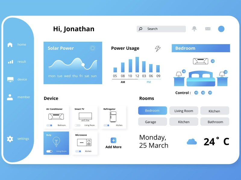
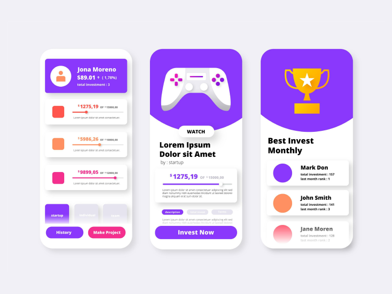
Uinkits – Our Figma Design System and UI Kits
We at uinkits understand the importance of great user experiences and creating amazing UI designs. That’s why we’ve developed a Figma UI Kit with design components that include these essential UI elements that enable you to design intuitive and user-friendly interfaces effortlessly.
“You press the button, we do the rest,” – Kodak.
Inspired by this iconic tagline from Kodak, we believe in simplifying the design process for you. Our Figma UI Kit, uinkits, is a complete design system with UI components that allows you, as a UI UX designer, to create your products as quickly as pressing a button.
Our design system includes components, icons, variables, cards, buttons, and everything you need for your design process. All you have to do is take your UI design component needed, and you’re ready to use it in your designs!
By
Gabriel Pana
•
July 31, 2024