When it comes to design, every element has specific design principles that need to be taken into consideration when starting a new project. And designing is not as easy of a job as some people may think. There have been countless times when I wished that my work would just get easy and my task would be done by itself. Throughout time, technology came and offered us just that, maybe not entirely, but at least made it easier. And variables also play a big part in this.
As Debbie Millman, writer of the bestseller “Why Design Matters” said, “Design is one of the few disciplines that is a science as well as an art.”. Design can make our lives easier and can put into practice what we think. One of the most accessible means through which we can achieve this in our UI/UX designs is by getting accustomed to variables.
Variables help us step up our game. They are the tools that help UI/UX designers make changes faster and deliver better results to their customers. Variables can store data with the help of tokenization. The design process of a website or an app does not need to be complicated. Variables make tasks simpler, they can provide solutions that can happen faster, helping us save time when creating a UI/UX design, managing one, or building complex prototypes.
However, if you are looking to make your work as efficient as you can you might also be interested in tokens. As Steve Jobs once said, “Design is not just what it looks like and feels like. Design is”, and tokens can help you achieve that.
Design tokens help you create collections that share the same variables. So, you can organize your design process better and have them classified using common variables, such as color, number, string, and boolean. These are further divided into more complex fields and groups. Think about classifying color variables. For example, they can be further divided into primary color variable groups or secondary color variable groups. And, tokens are the ones that help you organize your work.
Because we are aware of the importance variables hold in the design process, we have compiled a list of some of the most helpful tips you can start applying today to your UI UX designs in order to create more effortless and enhanced projects. Let’s take a look at five strategies of implementing variables in our day-to-day design work.
Create Design Tokens
When creating variables, you need tokens. Tokens can be interpreted like certain settings, or design options from corner radius, to a certain color or even spacing. For a better understanding let’s say you want to change the primary color in your design. We both know that doing this manually will take up a lot of time.
So we use tokenization instead. Think of it as a real-life token that is introduced into a machine to deliver you the wanted outcome wanted, in this situation, the outcome is changing the primary color in your design. So, a token it’s a setting that can help you deliver the right automatization based on the collections and groups you have created.
Do Your Research
If you are new to the subject, research it before! As with any new toll you first need to understand how it works and how it acts. Variables don’t act on their own, so, be up to date with any possible updates and changes. Understand the difference, make your design accessible, and create a well-documented guideline. With a guideline, you are able to create rules and best practices for all team members to know when and how to use variables. So, all team members can be in sync and understand how to keep a consistent design.
Don’t be Afraid To Ask
As Helen Hayes says “Every expert in anything was once a beginner”, so, don’t be afraid to ask. Learning new design concepts can get hard and understanding how they work best can be even harder. But when it comes to design, developers can have more to say than you would expect, they can help you understand if your variables are acting the way they should and they can also make sure that your design can be coded rightly.
Name Conventions And Guidelines For Variables
What are the naming conventions for Figma variables? Well, you need to store your ideas as clearly as possible and stay away from generic names. Name your variables based on what they represent, it could be secondary colors or a specific heading – so be precise. This will simplify your work and it will make it easier to apply and understand variables even when working in teams. I think we all can agree that at least once we tried toand find a certain variable but we couldn’t, so we had to ask our colleagues for guidance. So, use descriptive names.
Communication Is The Key
If you are working on a team, documentation, and communication are the key to a good UI/UX design. Variables are no easy job, so make sure that everyone is on board with any changes. So, you need to map all your variables and mention their usage, explain what they should do, and what is their purpose and usage. But, don’t forget examples are the key when it comes to understanding, so make sure to include some examples too.
After applying the variables to your components make sure that they are aesthetically pleasing.
Make sure that your elements work together. Being accessible while looking great is the purpose of any design. However, choosing the right variables to match your elements can be more challenging than you would think. Apply them first and see if they match together. You could have a beautiful card and an amazing button created with variables, but when put together they might not be the best decision. So, test every variable and see how it looks on multiple elements and create aesthetically pleasing UI/UX designs!
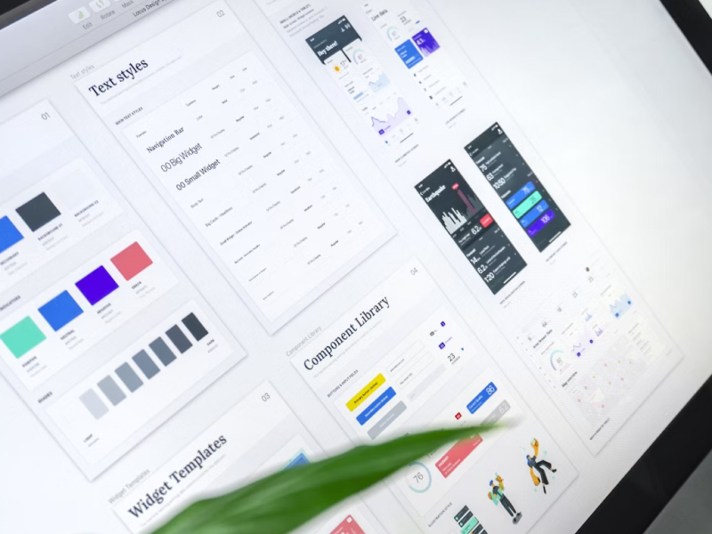
We at uinkits understand the importance of inputs in great user experiences and creating amazing UI designs. That’s why we’ve developed a Figma UI Kit with design components that include these essential UI elements that enable you to design intuitive and user-friendly interfaces effortlessly.
“You press the button, we do the rest,” – Kodak.
Inspired by this iconic tagline from Kodak, we believe in simplifying the design process for you. Our Figma UI Kit, uinkits, is a complete design system with UI components that allows you, as a UI UX designer, to create your products as quickly as pressing a button.
Our design system includes components, icons, variables, cards, buttons, and everything you need for your design process. All you have to do is take your UI design component needed, and you’re ready to use it in your designs!


