

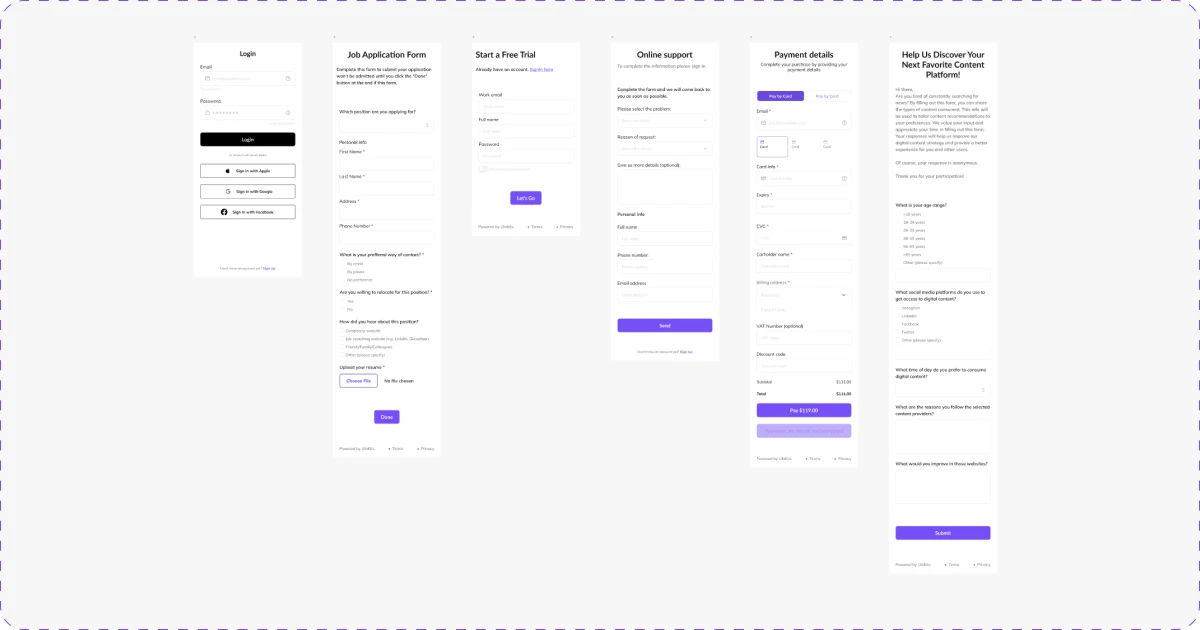
It is almost impossible to imagine a web design without any type of UI Design forms in it. This essential UI element has the overarching purpose of collecting different types of data from users. So, how to design a form? Let's find out!
What Are The Best Practices When Designing a Form?
Before we begin to work on UI design forms for our page, we should take several factors into account. And this is why principles of design are here to make the whole design process easier. As these elements are crucial parts of web design, following helpful guidelines will improve our websites and they can help make forms more efficient.
Even to the untrained eye, bad design is easy to spot. In the case of forms, UI UX designers need to keep in mind that asking the right questions is crucial to obtaining the information we desire. So, stay focused and think like your users. How would they respond to your questions? Are they clear and simple? This is why we came up with principles of design, to help you be sure that you are on the right track!
Principles of Design – Forms
1. Simple and straightforward content
The first principle of designing forms we gathered is one of the most crucial aspects of a form – the content of its fields. The UI label should always be placed above the container so our users can easily determine which one belongs to which input box. The use of upper case letters should be avoided for labels as they make them more difficult and annoying to read.
Another pro tip for writing content for forms is making use of placeholder text. For example, if we are writing an email entry, we could provide a placeholder like "email@domain.com". This helps our users better understand what we are asking from them.
2. Group Related Items
As much as we would like to avoid long forms, sometimes the context specifically requires them. Fortunately, there are ways to make them less tiring to the eye of the reader. Grouping related items into sections encourages our users to continue filling in the data.
Another common practice that avoids scaring visitors that they might lose progress is adding a Save button at the end of each section. An example of efficiently grouping similar items for an e-commerce platform or a web design can look like this:
- Personal Information
- Shipping Options
- Payment Method
- Additional Confirmation
3. Start with Easy Questions
Another principle of designing forms that are commonly used in interviews can be applied to the creation of forms. It logically makes a lot of sense to begin with easier and more mellow questions. If we want our users to go through an entire UI form, we have to make them feel comfortable.
Close-ended questions are suitable for the beginning because they require specific answers. Due to their less complex nature, they are very appropriate for compiling accurate data. After we list these types of questions we can move over to more intricate entries, such as multiple choice, open-ended, rating, and checklist questions. The key is to make our users feel confident that they have achieved progress while completing our forms.
4. Align Labels to the Right
Even though we initially mentioned that labels should always be placed above the input fields, sometimes we decide to go for the labels on the left side of them. If this is the case, we must ensure that the text is right aligned.
In UI UX design, the right alignment supports symmetry which is a key visual element in designs. Besides, it helps our users follow a more clear path when completing the form.
5. Display errors at the right time
Everybody makes mistakes. We should not punish our users by allowing them to go to the end of a form without informing them about the specific error they made. One of the most annoying features a UI design form can have is reset itself when you have incorrectly filled in a line. This will drive your users to exit the platform or web design and trigger a bad user experience. Instead, we should inform our users about this as soon as they type something wrong so they can easily solve the issue.
Another detail to keep in mind when you want to signal an error to your users is to be patient and let them finish filling the line in. It is neither professional nor beneficial to spam visitors with countless warnings.
6. Avoid Captcha
Although it was originally meant for avoiding spam, captcha has become a much-hated verification method in all types of forms. Fortunately, better alternatives exist. One example is the slider tool, which only requires users to slide a button from left to right.
Another substitute is using a checkbox or a radio button. They both imply base-level interactions which most users are already familiar with.
7. Avoid Writing When Possible
Another principle of designing UI forms regards long forms consisting strictly of text inputs for users to fill could easily become mundane, decreasing engagement. There are many cases in which there would be no need to ask the user to type in data that can be easily anticipated and predefined. This is why we should try to implement alternatives to input text-only lines.
For instance, instead of asking users to manually type their age, we could offer them the possibility to slide a point on an ascending line that indicates an age range.
8. Only Ask Valuable Questions
Asking users for a lot of information can be very tempting. We have to put ourselves in their shoes for a second and realize that nobody wants to answer countless questions when they could be spending their time doing something more productive or enjoyable. Instead of being bombarded with every question under the sun, users need to feel that they are doing something productive when filling in our form.
You could also choose to make a compromise and add optional questions. You might hit the jackpot and have a part of your users provide you with these answers, while you simultaneously avoid coming off as distrustful.
9. Suitable Date Input
Keep it short and simple! To this day, there are web designs that include a lot of unnecessary options in their forms. It should be pretty obvious that a person born this year or in the 1910s is not completing your form. This is why we must pay attention to inputs such as the one for dates.
The order in which we choose to display date options is also relevant and we should keep our demographic in mind when designing it. Although most of Europe uses the format DD/MM/YYYY, there are relevant parts of the world that prefer MM/DD/YYYY, such as The United States.
10. Use White Space
Also known as negative space, the main advantage of leaving white space between lines is establishing visual harmony. We use white space in order to create neat and uncluttered pages that visitors can effortlessly navigate. This is not just a blank space, but rather a key visual element used to enhance designs.
When we create forms, we have to use white spaces to ensure that information and fields are clearly separated from one another. Simpler and clearer designs are attractive to most users, as it helps them navigate a website with ease.
11. Mark Optional Fields
Marking optional fields instead of mandatory ones has a psychological explanation behind it. If we choose to signal to our users that some fields do not necessarily require their attention, we provide them with the feeling of having a choice. This feeling is positive, so we should seek to convey it. The opposite sentiments arise when we highlight the obligatory lines because it can cause users uncomfortable feelings like being controlled.
The most common way of highlighting that a field is optional is by adding an asterisk next to its label. We should also avoid adding too many optional entries so as to not overcrowd our design.
12. Highlight Limitations
Imposing limitations in the case of form design is crucial. We do this both to ensure that we guide our users toward strictly providing us with the necessary information, as well as to create a less tiring experience for them. Every UI designer should be aware that whether it is character limit, phone number, or date range, most forms should contain some form of limitation that is clearly displayed for the users.We should aim to showcase these limitations before the users start typing in.
We would usually place them through a word counter that shows progress in real-time. A common format is the written word number/maximum number of words.
13. Do Not Request Phone Numbers
Asking strangers for their number feels sketchy, doesn’t it? A recent study performed by ClickTale uncovered that a whopping 39% of their users' sign-ups were lost when they were asked for their phone numbers. Although there are cases where gathering this type of data from your users is essential, we should generally try to avoid asking them for it.
Phone numbers are regarded as some of the most private types of information. This is why many visitors could get suspicious of your intentions if you require them to give you their number. If the sole reason you need their number is to contact them, you could ask for their email address or social media links instead.
14. Inform Users About the Form Benefits
We have to be honest with ourselves and admit that no one really loves to fill in forms. At the end of the day, we still have to find solutions to make our visitors eager to complete them. One method that has proven to be pretty effective is by letting our users know that there are benefits to finishing this boring task.
One of the most commonly used strategies is informing users that they can gain access to a free trial if they choose to sign up for your page. This establishes a mutually rewarding relationship between us and our users.
40% OFF
Only this December
Upgrade to UI PRO version of Uinkits Systems to unlock 23.000 UI components.
Use the code "DEC40"
uinkits – Our Figma Design System and UI Kits
We at uinkits understand the importance of inputs in great user experiences and creating amazing UI designs. That’s why we’ve developed a Figma UI Kit with design components that include these essential UI elements that enable you to design intuitive and user-friendly interfaces effortlessly.
“You press the button, we do the rest,” – Kodak.
Inspired by this iconic tagline from Kodak, we believe in simplifying the design process for you. Our Figma UI Kit, uinkits, is a complete design system with UI components that allows you, as a UI UX designer, to create your products as quickly as pressing a button.
Our design system includes components, icons, variables, cards, buttons, and everything you need for your design process. All you have to do is take your UI design component needed, and you’re ready to use it in your designs!


