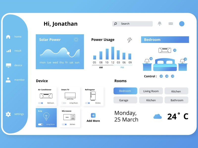
Emerging from the advertising world, banners serve many purposes, one of them being in the UI UX design. A race against time begins whenever a visitor enters a webpage. The goal of the race is to successfully make your banner seen by the users. And as a UI UX designer, you also need to be sure they received the information correctly. It can represent a way to advertise certain products, encourage actions, share directions, spread out information, or even services.
Yet, no matter the subject, most web pages and apps will contain some type of endorsement or prominent message concerning optional actions. And in the digital world, these endorsements usually come as banners. But how do we use banners correctly in UI UX design?
1. Keep it simple
Every UI designer and UX designer should be aware of one of the most frequently talked about rules in graphic design relates to the simplicity principle. Exercising our imagination through complex concepts may be tempting. In the case of banners, we, as UX UI designers, should try to make them as clear and easy to grasp as possible.
Do not get us wrong; copies, backgrounds, buttons, and animations that make up a banner should be far from boring! Often times it is more difficult to create a simple design than a sophisticated one. The reason is simple - it’s harder to convey a message in fewer words and with less intricate animations because we work under more restricted parameters.
So, we should strive to narrow the text down to a simpler form that conveys the message.
2. Choose suitable Colors
Color is the first element that we notice about most things around us. Luckily, there are a ton of color-meaning conventions that have already been predefined. Even though beauty stands in the eye of the beholder, most of us associate each color with similar concepts. A common example of color symbolism is red and themes related to love. So, if we had a dating app, implementing red banners would be a good choice.
However, it is crucial to be very familiar with your target audience. Different cultures and social groups may have drastically opposing perceptions of colors. Let’s look at the color green. In Western cultures, green is usually connected with luck, prosperity, and the environment. On the other hand, China associates it with infidelity.
Study your public very closely before deciding on a color scheme for your company.
3. Use Standard Banner Sizes
Another tip related to banners' graphic design and UI design aspect is their sizing options. According to market research performed by Google Adsense, these are the most popular and optimal banner sizes:
- 720 x 90px - Leaderboard
- 300 x 600 px - Half Page
- 336x280px - Large Rectangle
- 300 x 250px - Medium Rectangle
4. Use Buttons Appropriately
The buttons of banners have the purpose of acting as a CTA. A successful banner button should increase the click-through rate of your ad. These buttons must be labeled so that users know exactly what they will get if they press it. We should also make sure that the button is easily distinguishable from the rest of the banner, both from the text and background.
The most common placement for buttons is the lower right corner of the banner, as users have already been used to seeing them there. It also makes sense based on how people generally read texts.
5. Design Clear Frames
You have probably heard of the saying, "Looking for the needle in the haystack". If that’s how sour users feel when they are looking for elements on our page, it means we have failed as designers. They have to understand where our banners begin and end without putting in any effort.
A great tip for designing successful banners is correctly separating them from the rest of the web page or app. If your website has a very dark color scheme, you should choose brighter or lighter colors so that the banner comes forward and is easy to notice. Do not choose a color or outline that does not match the page's overall aesthetic. Even though we want our banners to shine, we must stick to the brand identity when we choose its design.
6. Write Text that is Easy to Read
While we are on the topic of contrast, we should take a look at some tips on writing the text in banners. If our users feel that components as small in amount of text as banners are tiresome, they will stop reading the rest of our page.
Like any other type of content, the headline and the body of text must have different sizes. The choice of the fonts should also make sense in relation to the overall aesthetic of our page, and it should be easy to read.
7. Integrate Animations
The human eye is developed to react to motion. This may come off as a no-brainer, but inserting animations into your banner can greatly increase engagement. Motion added to a banner will 100% be harder to miss compared to one that only contains still imagery. Besides this, animation boosts the chances of users revisiting your banner if they feel they missed something.
If you choose to implement an animated banner, you should ensure it is not too distracting from the other information it accompanies. Animations should support an idea, not obliterate it by being overly present.
8. Maintain Brand Consistency
"If you’re selling to everyone, you’re selling to no one."
When we are working with advertising banners, every UI UX designer should know that it’s important to remember that the ads we send out match our brand identity and message. For example, if our brand were very PG-13 and formal, displaying a banner alongside an animation showcasing people smoking cigarettes would be very inappropriate.
The visual aspects and the written content of our banners should align with our brand values and goals. If anything, a banner should be another contribution to positioning ourselves on the market.
9. Prepared Landing Page
A recent study published by WordStream showed that only 48% of marketers develop a new landing page for each of their campaigns. We should learn from our mistakes and understand that landing pages have high visitor-to-lead conversion rates, which can make our banners all the more efficient.
Even if this implies a few extra steps, preparing a landing page for our users to click on banners is a great marketing strategy.
10. Keep formats up to Date
The speed with which a banner will load on a page is crucial. Whether our banner signals an error or is meant to carry advertising material for a product, we need it to reach our users quickly. One method of ensuring that is by keeping the sizes of the files on the smaller end. Google Adwords advised that banners do not exceed 150 kilobytes.
Another helpful tip would be to stray away from anything outdated. For example, Flash Ads are becoming a thing of the past, so they should be avoided.
11. Logo Placement
Whenever a user sees our logo, our chances of our brand identity solidifying in their minds increase. Banners are great design elements where logos can be easily integrated. The placement of the logo should not be randomly assigned. Instead, we have to figure out what position makes the most sense visually and size it properly so that it does not overshadow the rest of the banner content.
12. Call to Action
Call-to-actions are an essential component of any banner. The main role of the CTA is to act as a bridge between the banner and the conversion rate. It appears as buttons that lead users to our end goal. We should make our CTAs as clear as possible by using easy-to-understand and familiar wording.
We at uinkits understand the importance of great user experiences and creating amazing UI designs. That’s why we’ve developed a Figma UI Kit with design components that include these essential UI elements that enable you to design intuitive and user-friendly interfaces effortlessly.
“You press the button, we do the rest.” – Kodak.
Inspired by this iconic tagline from Kodak, we believe in simplifying the design process for you. Our Figma UI Kit, uinkits, is a complete design system with UI components that allows you, as a UI UX designer, to create your products as quickly as pressing a button.
Our design system includes UI components, icons, variables, cards, buttons and everything you need for your design process. All you have to do is take your UI design component needed, and you’re ready to use it in your designs!


