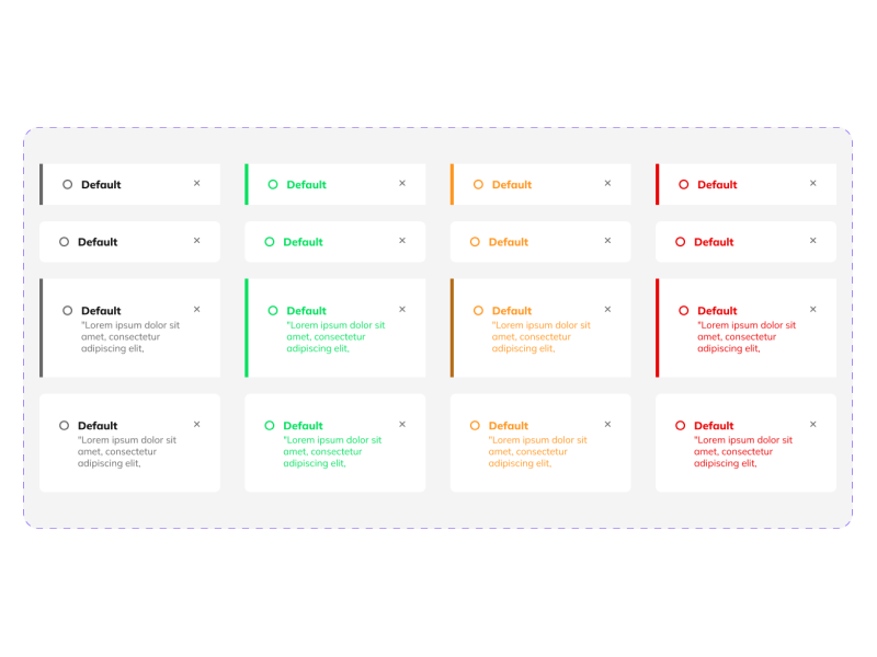
It’s safe to say that cards stepped up the entire UI UX design game, as they become a must-have when creating a design.
Cards need to be simple, counterintuitive, and aesthetically pleasing in order to create the best user experience. And, like any other playing cards, they can store up short stories that will be the helping hand needed when delivering a message and helping us organize the content.
Cards are UI elements that store information. Usually, cards are focused on a topic and aim to resume a larger topic or expose certain data. Think about online shopping – product cards make you analyze and scroll down within seconds. Or, when you are listening to your favorite jams, list cards can help you see the cover faster and recognize the song without even playing it.
Creating a design that delivers the right message while keeping an appealing user interface and creating a suitable user experience takes a lot of research and hours of hard work. And, as expected, design principles can improve our work, making us more productive and ensuring we follow the right path. So, let’s see some of the best design methods a UI UX designer should know when starting a new project.
1. Contrast
Pay attention to the contrast between your elements and the background. Colors and contrast play a big role when it comes to a good design. Seth Godin once said, "Don't find customers for your products, find products for your customers.", which can translate to creating designs that can be understood by your user.
So, make your design noticeable by opting for an outlined or even an elevated design. A simple border or a notorious shadow can step up your GUI. When it comes to creating an aesthetically pleasing UI UX design, we need to be careful with the color ratio and how it can impact our user experience and accessibility.
After all, the purpose of a card is to deliver the collected data, so we need to make sure that every user can identify and spot your UI cards as quickly as possible. So, the contrast between the cards and the background should create optimal usability.
2. Limit Content
I think the majority of us have heard about the expression less is more. Well, when it comes to designing cards, this rule needs to be applied. Scrolling endlessly is an activity that just becomes more and more acceptable. Surfing through websites or apps happens more and more, so UI UX designers started constraining all the information and making it under 100 characters.
Cards need to provide the message and be the label or the resume, which can trigger a better user experience. It makes the whole browsing process faster and easier by allowing the user to engage or scroll over. Think about how fast online shopping has become since product cards were introduced. We can look through endless items and decide within seconds if we want to click on them.
3. Keep It Simple
Don’t overdo it by adding excessive borders and dividing the element more than it should. Going full-on with dividers is a common mistake UI UX designers make when starting their journey.
However, segregating the content from a card has its perks, as it creates discontinuity confusion and unwanted visual noise. A convoluted user interface is the greatest enemy of a great UI UX design. Having divided content can also make the user think that the card holds different subjects, taking them further away from the primary message.
4. Stay Away From Confusion
Don’t add multiple ideas on a single card. It’s like the cover of a book with multiple titles on it – chaos. And no UI UX designer wants to create indecipherable designs. UI Designs should catch the eye of the viewer and be readable and deductible. A card must be straightforward, focusing on a central theme, object, subject, or matter. So, don’t add too much information just because you can. Keep it clean and easy to follow.
5. Keep It Balanced
One of the unwritten rules of design is to keep it consistent. Use the same fonts, styles, and sizes while keeping it readable. Research your audience and deliver to them the most suitable and consistent cards available. The size between the headline, the subheadline, the body, and the button needs to be chosen accordingly to have more appealing cards.
6. Hierarchy & Paddings
Discover which is your important feature! Question yourself about the important elements that need to pop up. It might be the product itself, the pricing, or the location. When you are looking for a new house, you want to see where it is how it looks, and know if it can fit in your price range.
So, hierarchy helps the user pick up the information faster. As in any design, cards are created following specific guidelines that make the design familiar to the user, and hierarchy is one of them.
Cards have a similar appearance, making them aesthetically appealing for the users, focusing mainly on a visual image followed by a headline or input fields that depend on the type of card used. However, the spaces left between the elements, also known as paddings, help create visual grouping and help with the consistency of the design.
7. Grid
Grids are here to make our lives easier. They are the stepping stone when it comes to building cards, as their primary mission is to keep the design in range and following the same path. Cards need to be identical to have the same size, width, and length, and grids can do just that when it comes to card-based layouts. A grid can change the size of your card and adapt it with the columns used appropriately.
However, if you create a responsive UX design, you will also need to create a breakpoint that will be the guide when it comes to organizing your cards in your design so you’ll have that aesthetically pleasing user interface.
8. When To Use Card Lists
Every designer wants to create a fast design. And, sometimes, using a card list can be the solution. Having an organized music library is a must-have in our lives, and list cards are our solution. In most cases, it’s easier to recognize your favorite jams by their cover. So, list cards are the best thing that has happened since Walkman. When designing list cards, the focus should be on the title, subtitle, and image.
9. Don’t Use Too Many Links
No one likes to get out of focus, and using multiple links in one card can simply do that. When you see a card, you naturally expect to receive information regarding a topic or subject. So, including multiple links in one card will delay user interaction and slow the process. Another difficulty that multiple links create is that they can trigger risk and uncertainty. And let’s be honest, no one wants to be redirected to shady sites.
10. Interactions
Interactions are the ones that help you step up your design game. They make the difference between a good design and a great one. Why? Well, it makes the user interface responsive and creates a link between the user and the device. So, it creates a deductible GUI and an interchange between the two worlds.
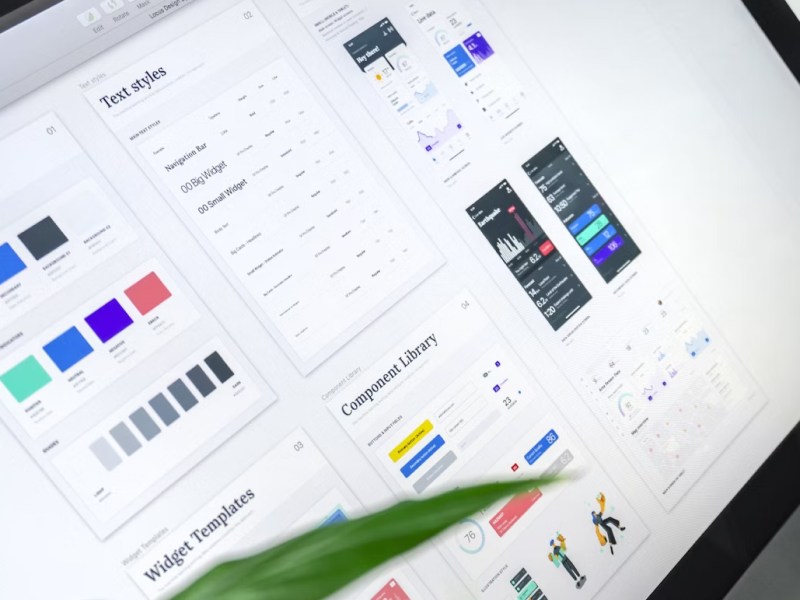
We at uinkits understand the importance of great user experiences and creating amazing UI designs. That’s why we’ve developed a Figma UI Kit with design components that include these essential UI elements that enable you to design intuitive and user-friendly interfaces effortlessly.
“You press the button, we do the rest.” – Kodak.
Inspired by this iconic tagline from Kodak, we believe in simplifying the design process for you. Our Figma UI Kit, uinkits, is a complete design system with UI components that allows you, as a UI UX designer, to create your products as quickly as pressing a button.
Our design system includes UI components, icons, variables, cards, buttons and everything you need for your design process. All you have to do is take your UI design component needed, and you’re ready to use it in your designs!


